Nº 619 of 629
Island live activities
A black pill at the top of the screen that springs between a timer, a food order and a call, splits in two, and grows into a card with controls.
Preview
Use it
Free to use · credit appreciated1 Once, in your project · Node 22.20+
npx skills add SusanAcharya/Design-Lounge 2 Then ask
Using the Design Lounge skill, build "Island live activities" (piece dynamic-island-activity) in my stack. Match its brief; restyle it onto my product's theme.
No skill? Paste the brief instead. It carries the numbers, tokens and behaviour.
<!-- Design Lounge Nº 619 · "Island live activities" · www.designlounge.live -->

# Island live activities

> **Build brief for a coding agent.** Rebuild this piece in the reader's stack. If they haven't said which stack, ask once, then default to semantic HTML + CSS + a little vanilla JS. Match the numbers below; don't "improve" them.

## What it is

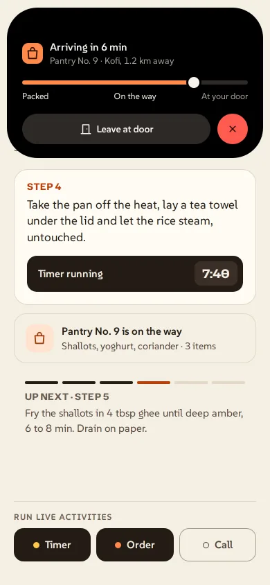
The pill that sits around the camera at the top of a phone screen, used as a stage for live activities from "Hearth", an invented cooking app. Over a recipe step, three activities can run: a rest timer, a grocery order from "Pantry No. 9" arriving in 6 minutes, and a call. One activity shows as a 200 × 36 pill with an icon on the left ear and a number on the right; two split into a pill and a 36px circle; a tap grows the pill into a 370px card with real controls. iOS 26-ish language, drawn without any real device hardware. The detail worth copying: width, height, radius and position are four springs on one integrator, so the shape bends through the morph instead of cross-fading between boxes, and the card's content is laid out at its final width from the start so nothing reflows mid-flight.

## Reference behaviour

1. First frame: timer and order are running and the order card is open: a black 370px card at top 11px, radius 44px, showing "Arriving in 6 min", "Pantry No. 9 · Kofi, 1.2 km away", an orange progress bar at about 76% with a white knob, stops "Packed · On the way · At your door", and two controls: **Leave at door** and a red close.
2. Tap anywhere outside the card (or press Escape): it springs back down. Because two activities run, it settles as a 200 × 36 pill shifted 22px left (order icon left, "6 min" right in orange) plus a 36px circle 6px to its right holding the timer ring.
3. The circle appears to come out of the pill: when only one activity runs, the circle sits hidden as a 28px disc under the pill's right end; when a second starts, it springs out to its slot.
4. Tap the pill: it grows into that activity's card. Tap the circle: the circle's activity grows into the card instead and the circle tucks back under.
5. Timer card: amber stopwatch tile, "Rice resting / Hearth · ends at 7:58 pm", a 40px amber countdown, then **Pause** (toggles to **Resume**), **+ 1 min**, red **End timer**.
6. Call card: initials tile "NH", "Noor Haddad / Mobile · 0:12", four green level bars, then **Mute**, **Speaker** (both toggle to a white fill) and a red **End call**.
7. "Run live activities" at the bottom toggles each activity. Starting the call opens its card at once (priority call > order > timer decides which one owns the pill). Ending any activity morphs the island to the new set; with none running, it rests at 124 × 36, the size of the camera cutout.
8. The step's "Timer running 7:42" button restarts the timer at 8:00. All numbers tick once a second: timer down, order minutes down, call duration up. When the timer reaches zero it reads "Done", the live region says "Rice timer done", and the card opens by itself if nothing else is open.

## Structure

```
390 × 844 (screen; the Lounge draws the frame, status bar and camera cutout)
┌──────────────────────────────────────┐
│ y11 ╭────────────── 370 ───────────╮ │  expanded: x10, h = card content, r44
│     │      (46px band: camera)      │ │
│     │ [■] Arriving in 6 min         │ │
│     │     Pantry No. 9 · Kofi…      │ │
│     │ ━━━━━━━━━━━━━━━━━━━●───────   │ │  bar 6px
│     │ Packed   On the way   At door │ │
│     │ [  ▯ Leave at door   ] ( × )  │ │  controls 44px
│     ╰───────────────────────────────╯ │
│  or: y11  ╭■────── 200 ───── 6 min╮ (◯) │  split: pill x = cx-122, dot x = pill+206
│ < Recipes                         ⌑  │  padding-top 62
│ HEARTH · WEEKNIGHT                    │
│ Saffron rice with crispy shallots 31  │
│ ┌ step card r20 ───────────────────┐ │
│ │ STEP 4 / text 17 / [Timer 7:42]  │ │

… 189 more lines. Copy or download for the full brief. Loading the source…Brief
229 linesBuild brief for a coding agent. Rebuild this piece in the reader’s stack. If they haven’t said which stack, ask once, then default to semantic HTML + CSS + a little vanilla JS. Match the numbers below; don’t “improve” them.
What it is
The pill that sits around the camera at the top of a phone screen, used as a stage for live activities from “Hearth”, an invented cooking app. Over a recipe step, three activities can run: a rest timer, a grocery order from “Pantry No. 9” arriving in 6 minutes, and a call. One activity shows as a 200 × 36 pill with an icon on the left ear and a number on the right; two split into a pill and a 36px circle; a tap grows the pill into a 370px card with real controls. iOS 26-ish language, drawn without any real device hardware. The detail worth copying: width, height, radius and position are four springs on one integrator, so the shape bends through the morph instead of cross-fading between boxes, and the card’s content is laid out at its final width from the start so nothing reflows mid-flight.
Reference behaviour
- First frame: timer and order are running and the order card is open: a black 370px card at top 11px, radius 44px, showing “Arriving in 6 min”, “Pantry No. 9 · Kofi, 1.2 km away”, an orange progress bar at about 76% with a white knob, stops “Packed · On the way · At your door”, and two controls: Leave at door and a red close.
- Tap anywhere outside the card (or press Escape): it springs back down. Because two activities run, it settles as a 200 × 36 pill shifted 22px left (order icon left, “6 min” right in orange) plus a 36px circle 6px to its right holding the timer ring.
- The circle appears to come out of the pill: when only one activity runs, the circle sits hidden as a 28px disc under the pill’s right end; when a second starts, it springs out to its slot.
- Tap the pill: it grows into that activity’s card. Tap the circle: the circle’s activity grows into the card instead and the circle tucks back under.
- Timer card: amber stopwatch tile, “Rice resting / Hearth · ends at 7:58 pm”, a 40px amber countdown, then Pause (toggles to Resume), + 1 min, red End timer.
- Call card: initials tile “NH”, “Noor Haddad / Mobile · 0:12”, four green level bars, then Mute, Speaker (both toggle to a white fill) and a red End call.
- “Run live activities” at the bottom toggles each activity. Starting the call opens its card at once (priority call > order > timer decides which one owns the pill). Ending any activity morphs the island to the new set; with none running, it rests at 124 × 36, the size of the camera cutout.
- The step’s “Timer running 7:42” button restarts the timer at 8:00. All numbers tick once a second: timer down, order minutes down, call duration up. When the timer reaches zero it reads “Done”, the live region says “Rice timer done”, and the card opens by itself if nothing else is open.
Structure
390 × 844 (screen; the Lounge draws the frame, status bar and camera cutout)
┌──────────────────────────────────────┐
│ y11 ╭────────────── 370 ───────────╮ │  expanded: x10, h = card content, r44
│     │      (46px band: camera)      │ │
│     │ [■] Arriving in 6 min         │ │
│     │     Pantry No. 9 · Kofi…      │ │
│     │ ━━━━━━━━━━━━━━━━━━━●───────   │ │  bar 6px
│     │ Packed   On the way   At door │ │
│     │ [  ▯ Leave at door   ] ( × )  │ │  controls 44px
│     ╰───────────────────────────────╯ │
│  or: y11  ╭■────── 200 ───── 6 min╮ (◯) │  split: pill x = cx-122, dot x = pill+206
│ < Recipes                         ⌑  │  padding-top 62
│ HEARTH · WEEKNIGHT                    │
│ Saffron rice with crispy shallots 31  │
│ ┌ step card r20 ───────────────────┐ │
│ │ STEP 4 / text 17 / [Timer 7:42]  │ │
│ └──────────────────────────────────┘ │
│ ┌ order row r18 ───────────────────┐ │
│ ▬ ▬ ▬ ▬ ─ ─   UP NEXT · STEP 5        │
│ ───────────────────────────────────── │
│ RUN LIVE ACTIVITIES                    │
│ [● Timer] [● Order] [○ Call]   48 tall │  34px bottom inset
└──────────────────────────────────────┘.screenisposition: relative,width: min(100%, 430px), centred,overflow: hidden.- Two absolutely placed
.blobdivs inside it:#main(role="region") and#dot. Each has a full-cover<button class="hit">first, then its layers. #mainlayers: three.cpcompact layers (lead icon + trail text,justify-content: space-between) and three.exexpanded layers.#dotlayers: three.mnminimal icons.- Page:
<nav>,<h1>, step<section>with the timer<button>, order row, up-next<section>, and the dock of threearia-pressedtoggles.
Tokens
:root {
  /* app ground */
  --paper: #f5efe4;
  --card: #fffbf4;
  --ink: #231b15;
  --ink-2: #54483f;
  --ink-3: #6b5e54;
  --line: #e3d8c7;
  --hearth: #b93f0c;        /* app accent: back link, step label, focus */
  --outside: #ebe3d6;       /* body around the 430px screen on wide viewports */

  /* island */
  --isl: #000;              /* pill and card, matches the camera cutout */
  --isl-3: #2c2926;         /* control buttons, empty bar track */
  --isl-ink: #f7f3ee;
  --isl-dim: #aaa39b;       /* secondary lines in the card */

  /* activities */
  --timer: #ffc94d;
  --order: #ff8a4c;
  --call: #5bd68a;
  --end: #ff5a4f;           /* close / end buttons, glyph #2a0705 */

  /* type */
  --num: "Hubot Sans", system-ui, sans-serif;   /* numerals and title, width axis 75–125 */
  --ui: "SUSE", system-ui, sans-serif;

  /* island geometry */
  --rest-w: 124px;          /* no activity: the camera cutout */
  --pill-w: 200px;
  --pill-h: 36px;
  --dot: 36px;
  --gap: 6px;
  --split-shift: 22px;      /* pill moves left when the dot appears */
  --top: 11px;
  --card-w: 370px;          /* screen width - 20, max 410 */
  --r-card: 44px;
  --card-pad: 46px 22px 20px;

  /* motion */
  --spring-main: 260;       /* stiffness, mass 1 */
  --damp-main: 22;
  --spring-dot: 300;
  --damp-dot: 26;
  --fade-out: 120ms;
  --fade-in: 200ms;
  --fade-delay: 90ms;
  --ease: cubic-bezier(.2, .7, .2, 1);
}
Typography
| Role | Family | Size | Weight | Width (font-stretch) | Notes |
|---|---|---|---|---|---|
| Recipe title | Hubot Sans | 31px / 1.02 | 700 | 112% | −0.02em |
| Step label, up-next label | Hubot Sans | 13px | 700 | 100% | UPPER +0.04em |
| Compact trail (“6 min”, “7:42”) | Hubot Sans | 15px | 650 | 80% | tabular-nums, activity colour |
| Card countdown | Hubot Sans | 40px | 700 | 118% | tabular-nums |
| Timer chip in step button | Hubot Sans | 17px | 700 | 110% | |
| Body, step text | SUSE | 17px / 1.4 | 400 | ||
| Card title / sub | SUSE | 15px 600 / 13px 400 | sub in --isl-dim | ||
| Control labels | SUSE | 14px | 600 | ||
| Kicker, dock heading | SUSE | 12px | 600 | UPPER +0.08em |
Motion
| Element | Trigger | Property | From → To | Timing | Reduced motion |
|---|---|---|---|---|---|
#main | any state change | x, y, width, height, radius | current → target | spring k260 c22, 4 substeps per frame | jumps to target |
#dot | split / merge / expand | x, y, width, height, radius | 28px disc under pill end ↔ 36px slot | spring k300 c26 | jumps |
| Outgoing layer | state change | opacity, visibility | 1 → 0 | 120ms --ease, visibility flips at 120ms | instant |
| Incoming layer | state change | opacity | 0 → 1 | 200ms --ease, 90ms delay | instant |
| Call level bars | call running | height | 6 → 15px | 1.1s alternate infinite, delays 0/−.4/−.8/−.2s | static 10px |
| Timer ring | every second | stroke-dashoffset | 56.5 × elapsed fraction | none (steps) | same |
| Order bar | every second | --p width and knob | progress % | none | same |
The spring keeps its velocity when a new target arrives mid-flight, so tapping again during a morph reverses it smoothly. The loop stops when every property is within 0.2px and 0.2px/s, then snaps exactly to target.
States
- Rest (no activity): 124 × 36, empty black, the pill’s button is disabled.
- Compact: one activity; lead icon at 9px, trail text at 12px from the right edge.
- Split: pill + dot; dot shows the second activity’s minimal icon.
- Expanded:
.xon#main; the hit button shrinks to the top 46px band and becomes the collapse control. - Toggles: off = 1.5px
#a99b8bring,--ink-2text, hollow dot; on =--inkfill,--papertext, dot filled with the activity colour. - Card toggles (Pause, Leave at door, Mute, Speaker): off
--isl-3; on--isl-inkfill with black text. Pause relabels to Resume. - Timer done: trail and countdown read “Done”, ring full.
- Focus-visible: 2px
--hearthoutline on the page, 2px--timeron the pill, 2px--isl-inkon card controls.
Accessibility
- The pill’s button carries
aria-expandedand a label built from the activity: “Pantry No. 9 order, show controls” / ”…, collapse”. The dot’s button reads “Rice timer, show controls”. - Escape collapses and returns focus to the pill. Ending an activity from its card also returns focus to the pill.
- Hidden layers use
visibility: hidden, so only the visible activity’s controls are in the tab order. - Dock toggles and card toggles are
<button aria-pressed>; end buttons have explicitaria-labels (“End timer”, “Stop tracking order”, “End call”). - A polite live region announces “Call with Noor Haddad started”, “Timer paused”, “Rice timer done”.
- Targets: card controls 44px, dock toggles 48px, the pill 36px tall over its full width with the whole card as backup.
- Contrast:
--isl-dimon black 8.4:1; orange trail on black 9.0:1;--ink-3on--paper5.5:1;--hearthon--card5.4:1.
Responsive rules
- Built for a 390 × 844 phone screen; leave 62px at the top for the status bar and 34px at the bottom.
- 360 wide: card width = screen − 20 (340px); the pill stays 200px, the dot slot still fits (pill x = 58).
- Wider than 430 (tablet or desktop preview): the screen column stays 430px, centred on
#ebe3d6; the card caps at 410px. - The island is positioned in the screen’s coordinates, never the window’s, so it stays centred on the camera when the column is centred.
Acceptance checklist
Always
- Width, height, radius and position animate together from one spring loop; no CSS transition on the box.
- Interrupting a morph reverses it without a jump (velocity is kept).
- Rest size equals the camera cutout (124 × 36 at y 11); the camera always sits inside the black shape.
- Two activities show as a 200px pill shifted 22px left plus a 36px circle 6px to its right.
- Tapping the pill or circle expands that activity to a full-width card with radius 44px; tapping outside or Escape collapses.
- Card content is laid out at final width and fades in after a 90ms delay; nothing reflows during the morph.
- Closed layers are
visibility: hidden(not focusable, not read). - Reduced motion: the shape jumps to its target, layers swap instantly, level bars are static.
This demo
- First frame shows the order card expanded over the recipe, timer running underneath.
- Priority call > order > timer; starting the call opens its card.
- Timer starts at 7:42 of 8:00 and ticks; order shows “6 min” and counts down; call counts up from 0:00.
- Pause / Resume, + 1 min, Leave at door, Mute, Speaker and the three end buttons all work.
Implementation notes
Four springs, one loop. Keep state, velocity and target per property and step them with small fixed substeps so the result does not depend on frame rate:
function step(now) {
  const dt = Math.min(.034, (now - last) / 1000); last = now; let moving = false;
  for (const o of blobs) {
    for (let n = 0; n < 4; n++) for (const p in o.t) {
      const a = -o.k * (o.s[p] - o.t[p]) - o.c * o.v[p];
      o.v[p] += a * dt / 4; o.s[p] += o.v[p] * dt / 4;
    }
    for (const p in o.t) if (Math.abs(o.s[p] - o.t[p]) > .2 || Math.abs(o.v[p]) > .2) moving = true;
    o.el.style.transform = `translate(${o.s.x}px,${o.s.y}px)`;
    o.el.style.width = o.s.w + 'px'; o.el.style.height = Math.max(0, o.s.h) + 'px';
    o.el.style.borderRadius = Math.max(0, o.s.r) + 'px';
  }
  raf = moving ? requestAnimationFrame(step) : 0;
}
Content that does not reflow. Expanded layers are pinned to the top-left at the final card width and clipped by the blob’s overflow: hidden; the card height target is read from the layer itself:
.blob { position: absolute; overflow: hidden; background: #000; }
.ly { position: absolute; opacity: 0; visibility: hidden;
  transition: opacity 120ms var(--ease), visibility 0s 120ms; }
.ly.on { opacity: 1; visibility: visible; transition: opacity 200ms var(--ease) 90ms; }
.ex { left: 0; top: 0; width: var(--xw); padding: 46px 22px 20px; }
Targets from state. One function maps the running set and the open activity to two rectangles, then starts the loop:
if (open) m = { x: cx - xw / 2, y: 11, w: xw, h: layer.offsetHeight, r: 44 };
else if (!a) m = { x: cx - 62, y: 11, w: 124, h: 36, r: 18 };
else if (!b) m = { x: cx - 100, y: 11, w: 200, h: 36, r: 18 };
else m = { x: cx - 122, y: 11, w: 200, h: 36, r: 18 };
d = b && !open ? { x: m.x + 206, y: 11, w: 36, h: 36, r: 18 } : { x: m.x + m.w - 30, y: 14, w: 28, h: 28, r: 14 };
Common mistakes: animating transform: scale on the box (it squashes the text and the radius); cross-fading two boxes instead of morphing one; measuring the card height while its layer is display: none (it returns 0, so use visibility); positioning against the window, which drifts off the camera when the screen column is centred.
Details
- Palette
- Type
- Hubot Sans · SUSE
- Motion
- Rich motion
- Build
- Multi-step
- Tags
Similar
Ride pickup live activity
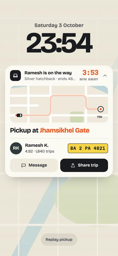
A lock-screen ride widget: a car drives a mini route map, the ETA counts down to Here, and one tap folds it to a compact progress row.
Island morph navbar
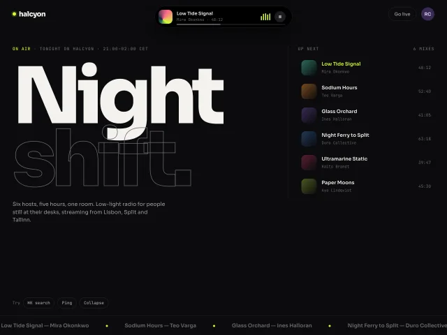
A centred black island in the header morphs 184×44 to 392, 480 or 540px for now-playing, a co-host ping and search, on a 520ms spring.
Mood pill that morphs into a card
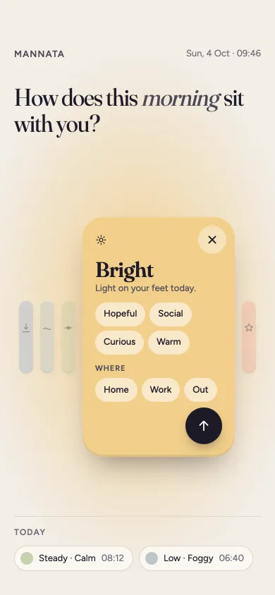
Five capsule pills for a mood check-in. Tap one and it springs open into a card with feeling chips, the others shrink aside, and the room light shifts to its hue.
Tactile chip tabs with a stretch
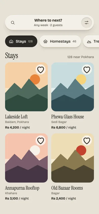
Clay-raised category chips that press down like keys, a dark well that stretches and springs to the chosen tab, and skeleton cards that hand over to listings.
Hold-to-record voice note
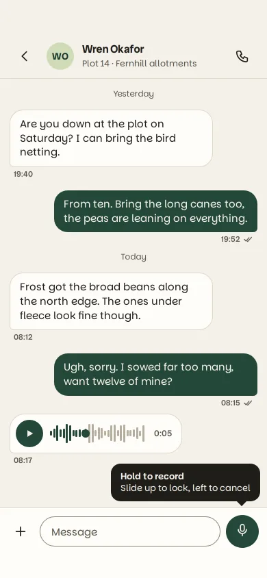
A chat composer mic you hold to record: it swells, a live waveform grows, slide left to bin the note or up to lock, release to send a scrubbable bubble.
Avatar stack with presence
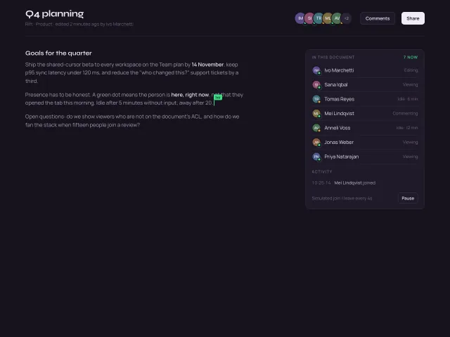
Overlapping initials avatars with a +N overflow chip, hover fans them apart, pulsing green presence dots, name/status tooltips, and a simulated join or leave every 4s.