Nº 620 of 629
Liquid squish toggles
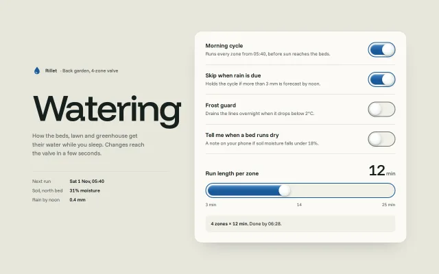
Switches whose knob is a soft droplet: it squashes on press, stretches as it travels, pours water into the track behind it and wobbles on arrival.
Preview
Use it
Free to use · credit appreciated1 Once, in your project · Node 22.20+
npx skills add SusanAcharya/Design-Lounge 2 Then ask
Using the Design Lounge skill, build "Liquid squish toggles" (piece toggle-liquid-squish) in my stack. Match its brief; restyle it onto my product's theme.
No skill? Paste the brief instead. It carries the numbers, tokens and behaviour.
<!-- Design Lounge Nº 620 · "Liquid squish toggles" · www.designlounge.live -->

# Liquid squish toggles

> **Build brief for a coding agent.** Rebuild this piece in the reader's stack. If they haven't said which stack, ask once, then default to semantic HTML + CSS + a little vanilla JS. Match the numbers below; don't "improve" them.

## What it is

The watering settings of "Rillet", an invented controller for a four-zone garden valve. Four switches and one slider share a single physical idea: the knob is a soft droplet of water. Press it and it squashes wide; send it across and it stretches along the track while blue water pours in behind it, lagging a beat like a real liquid; when it lands it flattens against the wall and wobbles to rest. The slider thumb is the same droplet, and it sloshes (stretches and leans) with how fast you drag. The detail worth copying: three tiny springs per control (position, shape, water level) driven by one `requestAnimationFrame` loop that sleeps when everything is still, on top of a real `<button role="switch">` and a real `<input type="range">`.

## Reference behaviour

1. First frame, 1280 × 800: a warm grey page. Left column: brand row (blue droplet mark, "Rillet · Back garden, 4-zone valve"), a 108px "Watering" headline, a 17px lede, and a hairline-topped list "Next run Sat 1 Nov, 05:40 / Soil, north bed 31% moisture / Rain by noon 0.4 mm". Right column: a 620px panel holding four switch rows, then the slider block.
2. Rows: "Morning cycle" (on), "Skip when rain is due" (on), "Frost guard" (off), "Tell me when a bed runs dry" (off). Each row: 17px/600 label, 14px grey description, 80 × 44 switch on the right.
3. Click a switch (or its label, or press Space/Enter on it): `aria-checked` flips at once; the knob springs to the other end with a visible stretch, the water level follows on its own slower spring, the knob overshoots into the wall, flattens tall-and-narrow for ~60ms, then wobbles back to round in about 400ms.
4. Pointer down on a switch: the knob squashes wide (scaleX 1.2, scaleY 0.89) and holds that while pressed. Space held does the same.
5. Drag a switch: after 4px of horizontal movement the knob follows the pointer 1:1 (travel 36px); beyond either end it moves at 25% (rubber band). Release decides by position plus a velocity throw: `x + v × 0.06 > 0.5` means on. The click that follows a drag is swallowed so it cannot flip the switch back.
6. Off state shows no water at all; the water blob hides exactly under the knob and fades in within the first 12% of travel.
7. Slider "Run length per zone", 3 to 25 min, step 1, starts at 12. The value is printed at 44px to the right of the label ("12 min"). Ticks under the track: "3 min", "14", "25 min".
8. Drag or arrow the slider: the native input moves instantly; the droplet thumb follows on a stiff spring, stretches up to 1.34× along the track and skews up to 16° against the direction of travel; the water fill trails it on a softer spring and catches up when you stop.
9. A summary chip under the slider reads "4 zones × 12 min. Done by 06:28." and updates live (end time = 05:40 + 4 × minutes). If Morning cycle is off it reads "Morning cycle is off. Nothing runs until you turn it back on." and "Next run" in the left column reads "Paused".
10. Each switch change is announced in a polite live region: "Frost guard, on".
11. Reduced motion: every spring is skipped; knob, water and thumb jump to their resting place in one frame. Nothing else changes.

## Structure

```
1280 × 800, grid: minmax(0,400px) | 72 gap | minmax(0,620px), centred, padding 48/40
┌───────────────────────────────┬──────────────────────────────────────────────────┐
│ ◉ Rillet · Back garden…       │ ┌ panel #fbfaf5, r22, 1px #d8d8cc, pad 10/32/30 ┐│
│                               │ │ Morning cycle                      (████◯)    ││ row: 20px v-pad
│ Watering   108px/500          │ │ Runs every zone from 05:40…                   ││ 1px hairline
│                               │ │ Skip when rain is due              (████◯)    ││
│ lede 17px, max 340px          │ │ Frost guard                        (◯    )    ││ switch 80×44
│ ───────────────────────────── │ │ Tell me when a bed runs dry        (◯    )    ││
│ Next run       Sat 1 Nov…     │ │                                               ││
│ Soil, north bed 31% moisture  │ │ Run length per zone                   12 min  ││ 44px value
│ Rain by noon   0.4 mm         │ │ (██████████████◯                          )   ││ 44px track
│                               │ │ 3 min               14               25 min   ││
│                               │ │ [ 4 zones × 12 min. Done by 06:28.         ]  ││ chip, r12

… 195 more lines. Copy or download for the full brief. Loading the source…Brief
235 linesBuild brief for a coding agent. Rebuild this piece in the reader’s stack. If they haven’t said which stack, ask once, then default to semantic HTML + CSS + a little vanilla JS. Match the numbers below; don’t “improve” them.
What it is
The watering settings of “Rillet”, an invented controller for a four-zone garden valve. Four switches and one slider share a single physical idea: the knob is a soft droplet of water. Press it and it squashes wide; send it across and it stretches along the track while blue water pours in behind it, lagging a beat like a real liquid; when it lands it flattens against the wall and wobbles to rest. The slider thumb is the same droplet, and it sloshes (stretches and leans) with how fast you drag. The detail worth copying: three tiny springs per control (position, shape, water level) driven by one requestAnimationFrame loop that sleeps when everything is still, on top of a real <button role="switch"> and a real <input type="range">.
Reference behaviour
- First frame, 1280 × 800: a warm grey page. Left column: brand row (blue droplet mark, “Rillet · Back garden, 4-zone valve”), a 108px “Watering” headline, a 17px lede, and a hairline-topped list “Next run Sat 1 Nov, 05:40 / Soil, north bed 31% moisture / Rain by noon 0.4 mm”. Right column: a 620px panel holding four switch rows, then the slider block.
- Rows: “Morning cycle” (on), “Skip when rain is due” (on), “Frost guard” (off), “Tell me when a bed runs dry” (off). Each row: 17px/600 label, 14px grey description, 80 × 44 switch on the right.
- Click a switch (or its label, or press Space/Enter on it):
aria-checkedflips at once; the knob springs to the other end with a visible stretch, the water level follows on its own slower spring, the knob overshoots into the wall, flattens tall-and-narrow for ~60ms, then wobbles back to round in about 400ms. - Pointer down on a switch: the knob squashes wide (scaleX 1.2, scaleY 0.89) and holds that while pressed. Space held does the same.
- Drag a switch: after 4px of horizontal movement the knob follows the pointer 1:1 (travel 36px); beyond either end it moves at 25% (rubber band). Release decides by position plus a velocity throw:
x + v × 0.06 > 0.5means on. The click that follows a drag is swallowed so it cannot flip the switch back. - Off state shows no water at all; the water blob hides exactly under the knob and fades in within the first 12% of travel.
- Slider “Run length per zone”, 3 to 25 min, step 1, starts at 12. The value is printed at 44px to the right of the label (“12 min”). Ticks under the track: “3 min”, “14”, “25 min”.
- Drag or arrow the slider: the native input moves instantly; the droplet thumb follows on a stiff spring, stretches up to 1.34× along the track and skews up to 16° against the direction of travel; the water fill trails it on a softer spring and catches up when you stop.
- A summary chip under the slider reads “4 zones × 12 min. Done by 06:28.” and updates live (end time = 05:40 + 4 × minutes). If Morning cycle is off it reads “Morning cycle is off. Nothing runs until you turn it back on.” and “Next run” in the left column reads “Paused”.
- Each switch change is announced in a polite live region: “Frost guard, on”.
- Reduced motion: every spring is skipped; knob, water and thumb jump to their resting place in one frame. Nothing else changes.
Structure
1280 × 800, grid: minmax(0,400px) | 72 gap | minmax(0,620px), centred, padding 48/40
┌───────────────────────────────┬──────────────────────────────────────────────────┐
│ ◉ Rillet · Back garden…       │ ┌ panel #fbfaf5, r22, 1px #d8d8cc, pad 10/32/30 ┐│
│                               │ │ Morning cycle                      (████◯)    ││ row: 20px v-pad
│ Watering   108px/500          │ │ Runs every zone from 05:40…                   ││ 1px hairline
│                               │ │ Skip when rain is due              (████◯)    ││
│ lede 17px, max 340px          │ │ Frost guard                        (◯    )    ││ switch 80×44
│ ───────────────────────────── │ │ Tell me when a bed runs dry        (◯    )    ││
│ Next run       Sat 1 Nov…     │ │                                               ││
│ Soil, north bed 31% moisture  │ │ Run length per zone                   12 min  ││ 44px value
│ Rain by noon   0.4 mm         │ │ (██████████████◯                          )   ││ 44px track
│                               │ │ 3 min               14               25 min   ││
│                               │ │ [ 4 zones × 12 min. Done by 06:28.         ]  ││ chip, r12
└───────────────────────────────┴──────────────────────────────────────────────────┘

Switch (border-box 80 × 44, border 2):        Slider (.rng 44px tall, input on top):
 ┌──────────────────────────────┐              bed span (well colour)
 │ fill: left 5, top/bottom 5,  │              fill: left 7, top/bottom 7, width 30 + L·T
 │   width 30 + L·36            │              knob: left 5, top 5, 34 × 34
 │ knob: left 3, top 3, 34 × 34 │              input: inset 0, 2px border, transparent
└──────────────────────────────┘ T = input.clientWidth − 40- Left column is a
sectionlabelled by theh1; the panel ismainwitharia-label="Watering settings". - Each row: a
label forthe switch (a button is labelable, so clicking the text toggles it), apdescription wired witharia-describedby, andbutton type="button" role="switch" aria-checked. - The button is the track. It contains two
aria-hiddendecorative spans:.fill(water) then.knob. - The slider is a native
input type="range"laid over three decorative spans (bed, fill, knob) inside a 44px.rngwrapper; the value is anoutput for="len"; the chip is ap aria-live="polite"and is the input’saria-describedby. - One visually hidden
p aria-live="polite"announces switch changes.
Tokens
:root {
  /* colour */
  --bg: #e7e6dc;        /* page */
  --panel: #fbfaf5;     /* settings panel */
  --ink: #16211d;       /* text */
  --ink-2: #55605a;     /* descriptions, ticks, 6.3:1 on panel */
  --line: #d8d8cc;      /* hairlines, panel border */
  --edge: #6c756f;      /* off-track border, 4.6:1 on panel */
  --well: #f1f0e8;      /* empty track and slider bed, chip */
  --water: #1a5a9a;     /* liquid, on-track border, slider border, 6.8:1 */
  --water-hi: #4589c9;  /* top of the liquid gradient */
  --knob: #ffffff;
  --focus: #c4561d;     /* focus ring */

  /* type */
  --display: "Funnel Display", system-ui, sans-serif;
  --sans: "Funnel Sans", system-ui, sans-serif;
  --fs-hero: 108px; --fs-value: 44px; --fs-lede: 17px; --fs-label: 17px; --fs-body: 15px; --fs-small: 14px; --fs-tick: 13px;

  /* geometry */
  --switch-w: 80px; --switch-h: 44px; --switch-border: 2px;
  --knob: 34px; --knob-inset: 3px; --travel: 36px;
  --fill-inset: 5px; --fill-h: 30px;
  --slider-h: 44px; --thumb-hit: 40px;
  --r-panel: 22px; --r-chip: 12px; --r-pill: 999px;
  --space: 4px 8px 12px 16px 20px 24px 32px 48px 72px;

  /* depth */
  --shadow-panel: 0 1px 0 #fff inset, 0 24px 48px -32px rgba(22,33,29,.35);
  --shadow-knob: 0 1px 1px rgba(22,33,29,.25), 0 3px 8px rgba(22,33,29,.2), inset 0 -2px 3px rgba(26,90,154,.14);
  --knob-face: radial-gradient(circle at 36% 30%, #fff 0 30%, #eef3ef 70%, #dfe7e2);
  --water-face: linear-gradient(180deg, var(--water-hi), var(--water) 55%);

  /* motion: springs (stiffness k, damping c, unit mass) */
  --spring-switch: 330 17;     /* knob position, underdamped: overshoots */
  --spring-water: 150 19;      /* switch water level, lags the knob */
  --spring-shape: 520 13;      /* squash/stretch, wobbles */
  --spring-thumb: 520 34;      /* slider thumb, near critical */
  --spring-slider-water: 230 24;
  --ease: cubic-bezier(.2,.7,.2,1); /* border colour, 220ms */
}
Typography
| Role | Family | Size | Weight | Line-height | Tracking | Case |
|---|---|---|---|---|---|---|
| Headline “Watering” | Funnel Display | 108px (72px < 960) | 500 | 0.9 | −0.045em | Title |
| Slider value | Funnel Display | 44px, tabular | 500 | 1 | −0.03em | — |
| Value unit “min” | Funnel Sans | 16px | 500 | 1 | 0 | lower |
| Brand row | Funnel Sans | 14px | 500 | 1.5 | 0 | Title |
| Lede | Funnel Sans | 17px | 400 | 1.5 | 0 | Sentence |
| Row label | Funnel Sans | 17px | 600 | 1.3 | −0.005em | Sentence |
| Row description, chip, list | Funnel Sans | 14px | 400 (values 600) | 1.5 | 0 | Sentence |
| Ticks | Funnel Sans | 13px, tabular | 400 | 1.5 | 0 | — |
Motion
All springs are integrated by hand: semi-implicit Euler, 4 substeps per frame, dt capped at 32ms.
| Thing | Trigger | Property | From → to | Spring / duration | Reduced motion |
|---|---|---|---|---|---|
| Knob travel | click, key, release | translateX | 0 ↔ 36px | k 330, c 17 (overshoot) | instant |
| Wall hit | x crosses 0 or 1 | x clamped, v × −0.22, shape velocity −0.5·abs(v) | flatten tall, then wobble | shape spring | none |
| Squash | pointer down / Space held | shape s | 0 → 0.2 (scaleX 1.2, scaleY 0.89) | k 520, c 13 | none |
| Stretch | moving | shape target | 0.055·abs(v), max 0.42 | k 520, c 13 | none |
| Lean | moving | translateX offset | −v·travel·0.004, max ±6px, 0 at the walls | follows v | none |
| Water level | knob moves | fill width | 30px + L·36px | k 150, c 19 | instant |
| Water fade | L or x near 0 | fill opacity | max(L,x)·8, clamped 0…1 | follows | instant |
| On border | aria-checked | border-color | #6c756f ↔ #1a5a9a | 220ms —ease | instant |
| Slider thumb | input event | translateX | follows value | k 520, c 34 | instant |
| Slider slosh | thumb velocity | scaleX / skewX | up to 1.34 / ±16° | k 520, c 13 | none |
| Slider water | thumb moves | fill width | 30px + L·T | k 230, c 24 | instant |
Shape maps to transform as sx = 1 + s, sy = clamp(1 − 0.55·s, 0.76, 1.18), with s clamped to −0.3…0.5. Negative s (after a wall hit) gives the tall, narrow droplet.
States
- Off: well fill
#f1f0e8, 2px#6c756fborder, knob left, no water visible. - On: 2px
#1a5a9aborder, knob right, water fills 66px of the 76px inner track (5px margin all round). - Pressed: knob squashed wide while held; it stays round again 300ms after release.
- Dragging: knob follows the pointer; water trails; past the ends it rubber-bands at 25%.
- Focus-visible: 3px
#c4561doutline, 3px offset, on the switch and on the range input (the whole track). - Hover: cursor pointer only; the knob does not move on hover, so pointer users never feel a fake press.
- Morning cycle off: summary chip and “Next run” change copy; the slider still works.
Accessibility
- Switches are
button role="switch"witharia-checked; Space and Enter toggle natively viaclick. The visible label is alabel for, so the accessible name is the row title, and the description isaria-describedby. - The slider is a native range: arrows, PageUp/PageDown, Home and End all work with no extra code. Its value is mirrored into an
output, and the summary chip is a polite live region. - A hidden polite region announces ”
touch-action: noneon the switch and the range so a horizontal drag on a phone never scrolls the page.- Contrast: ink on panel 15.8:1; descriptions 6.3:1; off border 4.6:1 and on border 6.8:1 against the panel (above the 3:1 needed for control edges); white knob is decoration, the border carries the state.
- Hit targets: switch 80 × 44, label text also toggles; range 44px tall across the full panel width.
Responsive rules
- ≥ 1280: two columns as drawn.
- 961 to 1279: columns shrink; the grid stays two-up because both columns are
minmax(0, …). - ≤ 960: one column, gap 28px, padding 32/20/40, headline 72px, panel padding 4/20/22, row gap 16px; the page scrolls vertically.
- ≤ 400: row labels 16px, descriptions 13.5px. Switch size never changes: 80 × 44 is the touch target.
- Slider travel is re-measured on every frame from
input.clientWidth, and redrawn on resize, so the thumb never drifts from the native thumb.
Acceptance checklist
Always
- Every switch is a
button role="switch"witharia-checked, and the button itself carries a 2px border at ≥ 3:1 in both states. - Press squashes the knob wide; travel stretches it along the track; arrival flattens it against the wall and it wobbles back to round.
- Water fills the track behind the knob on its own slower spring and is invisible in the off state.
- Dragging a switch works with 1:1 tracking, 25% rubber band past the ends, and a velocity throw on release; the trailing click is ignored.
- The slider is a native
input type="range"; the droplet thumb lines up with the native thumb centre at min, middle and max. - Fast slider drags visibly stretch and skew the thumb; slow drags barely do.
- One rAF loop drives every body and stops when all are still.
- Focus ring is visible on every switch and on the slider.
- Reduced motion: no springs, controls land in their final state in one frame.
- No horizontal scroll at 390px.
This demo
- Rows “Morning cycle”, “Skip when rain is due”, “Frost guard”, “Tell me when a bed runs dry”, starting on, on, off, off.
- Slider 3 to 25 min, starts at 12; chip reads “4 zones × 12 min. Done by 06:28.”
- Turning Morning cycle off changes the chip copy and sets “Next run” to “Paused”.
- Water
#1a5a9aover--water-hi #4589c9; off border#6c756f; focus#c4561d.
Implementation notes
One body, three springs. Each control is a plain object stepped by a shared loop. t is the target (0 or 1), x the knob, s the shape, L the water.
function step(b, dt) {
  if (!b.drag) {
    b.v += (b.K * (b.t - b.x) - b.C * b.v) * dt; b.x += b.v * dt;
    if (b.wall && (b.x > 1 || b.x < 0)) {      // hit the end: flatten, bounce a little
      b.sv -= Math.abs(b.v) * .5; b.x = Math.min(1, Math.max(0, b.x)); b.v *= -.22;
    }
  }
  b.sv += (520 * (b.sT() - b.s) - 13 * b.sv) * dt; b.s += b.sv * dt;   // shape wobble
  b.Lv += (b.LK * (b.x - b.L) - b.LC * b.Lv) * dt; b.L += b.Lv * dt;   // water lags
}
// shape target: pressed adds .2, speed adds up to .42
b.sT = () => (b.press ? .2 : 0) + Math.min(.42, Math.abs(b.v) * .055);
Draw. Translate, then scale; never animate width on the knob.
const s = clamp(b.s, -.3, .5), sx = 1 + s, sy = clamp(1 - s * .55, .76, 1.18);
const lean = clamp(-b.v * TRAVEL * .004, -6, 6) * clamp(Math.min(b.x, 1 - b.x) * 5, 0, 1);
knob.style.transform = `translateX(${b.x * TRAVEL + lean}px) scale(${sx}, ${sy})`;
fill.style.width = 30 + clamp(b.L, 0, 1) * TRAVEL + 'px';
fill.style.opacity = clamp(Math.max(b.L, b.x) * 8, 0, 1);
A drag that still clicks. Let click do the keyboard and tap toggles; a drag decides on pointerup and swallows the click the browser fires next.
el.addEventListener('pointerup', () => {
  b.press = false;
  if (b.drag) { b.drag = false; swallow = true; set(b.x + b.v * .06 > .5); }
});
el.addEventListener('click', () => { if (swallow) { swallow = false; return; } set(b.t < .5); });
Common mistakes:
- Animating the knob with a CSS transition: you lose the velocity that drives the stretch and the wobble.
- Letting the water show in the off state; hide it under the knob and fade it with
max(L, x). - Making the slider a custom div with
role="slider"when a styled native range does the keyboard work for free. Keep the native thumb transparent but sized to the droplet (40px) so the hit area matches. - Putting the 3:1 border on a wrapper instead of the control; checkers and users read the control’s own edge.
- Leaving the rAF loop running forever; stop it when every body is at rest.
Details
- Palette
- Type
- Funnel Display · Funnel Sans
- Motion
- Rich motion
- Build
- Multi-step
- Tags
Similar
Stretch switch
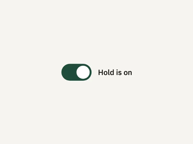
Hold starts on. Press the thumb and it widens. Release and it slides. The label says on or off.
Toggle switch set
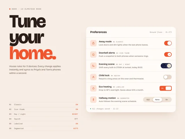
Six toggle temperaments (classic, icon thumb, day/night, squish, labelled, segmented) in a smart-home preferences card with a live status index.
Slider field
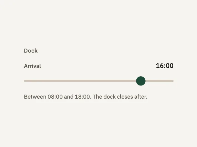
A dock arrival from 08:00 to 18:00. The thumb starts at 16:00. The value sits beside the label and updates as the thumb moves.
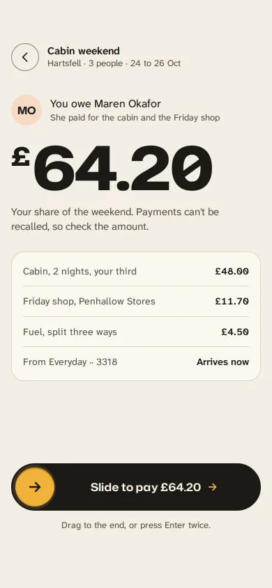
Slide to pay back a friend
A gold handle you drag along an ink track to repay a friend: letters dim as it passes, it resists near the end, snaps through at 90% and becomes a receipt.
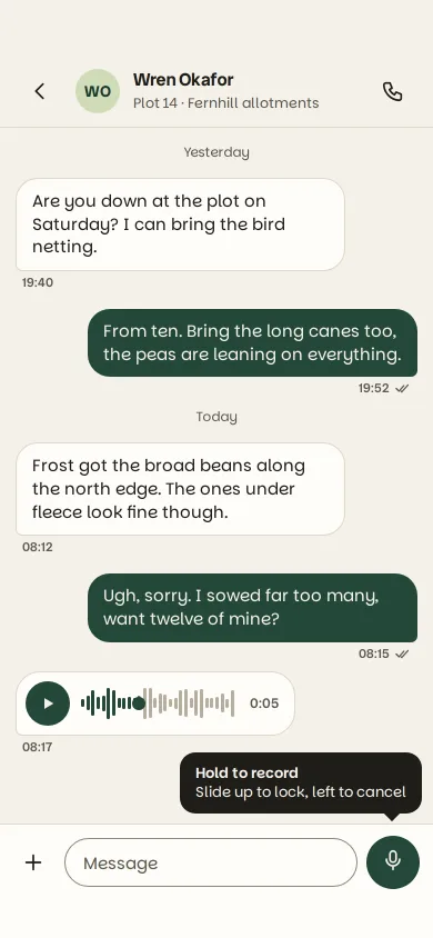
Hold-to-record voice note
A chat composer mic you hold to record: it swells, a live waveform grows, slide left to bin the note or up to lock, release to send a scrubbable bubble.
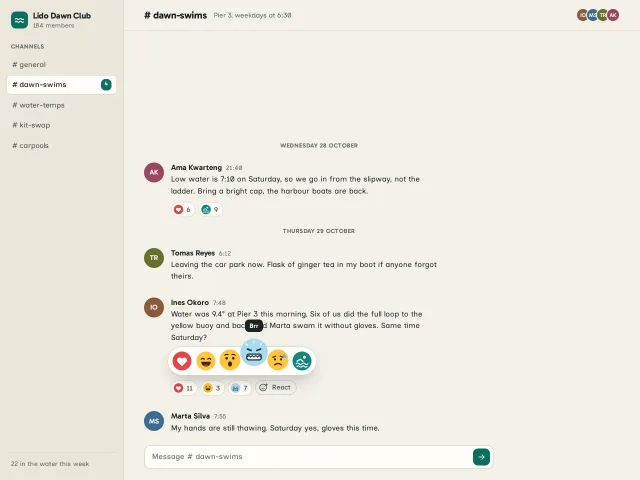
Reaction burst picker
Hold the react button, slide across six hand-drawn faces that swell under your finger, let go: the face flies home, bursts, and the count rolls.