Nº 661 of 677
Update required and outage screens
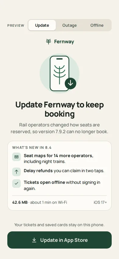
Three calm stop screens for one rail app: a forced update with what's new, size and time; a planned outage with a back-by time; and offline with retry.
Preview
Use it
Free to use · credit appreciated1 Once, in your project · Node 22.20+
npx skills add SusanAcharya/Design-Lounge 2 Then ask
Using the Design Lounge skill, build "Update required and outage screens" (piece phone-error-update-required) in my stack. Match its brief; restyle it onto my product's theme.
No skill? Paste the brief instead. It carries the numbers, tokens and behaviour.
<!-- Design Lounge Nº 661 · "Update required and outage screens" · www.designlounge.live -->

# Update required and outage screens

> **Build brief for a coding agent.** Rebuild this piece in the reader's stack. If they haven't said which stack, ask once, then default to semantic HTML + CSS + a little vanilla JS. Match the numbers below; don't "improve" them.

## What it is

The three screens a fictional rail-ticket app, Fernway, shows when it can't carry on: a forced update, a planned outage, and offline. A small Preview segmented control at the top switches between them for the demo; in a product only one would show. Each screen has the same skeleton: the fern wordmark, one illustration on a tinted 76px-radius disc, a 26px headline that says what happened in plain words, one card of facts, and one full-width 56px button in the thumb zone. The language is iOS 26-ish on a single warm paper material: 16–18px radii, a segmented control, soft 1px rings instead of shadows. The detail worth copying is the honesty: each screen says why (operators changed seat booking), what still works (tickets in Wallet still scan at the gate), and when it ends (back by 04:30 CET), and offers exactly one thing to do.

## Reference behaviour

1. Initial state: **Update** is selected. Headline "Update Fernway to keep booking". Lede "Rail operators changed how seats are reserved, so version 7.9.2 can no longer book." Card "What's new in 8.4" with three lines, each with a 28px fern-tint icon tile:
   - **Seat maps for 14 more operators,** including night trains.
   - **Delay refunds** you can claim in two taps.
   - **Tickets open offline** without signing in again.
   Under a hairline: "**42.6 MB** · about 1 min on Wi‑Fi" and "iOS 17+". Caption "Your tickets and saved cards stay on this phone." Button **Update in App Store** with a download icon.
2. Tap the button: a spinner replaces the icon, the label reads "Opening App Store…", `aria-busy="true"`, the fill lightens to `#2E6B4F`; after 1400ms it returns. A second tap while busy does nothing.
3. **Outage** tab: illustration of a moon over a track with a striped barrier on a deep fern disc. Headline "Fernway is down for planned work". Lede "We're moving bookings to new servers tonight. Nothing you've bought is affected." Card: an amber pill "Maintenance in progress" and "Started 02:00"; an 8px timeline 48% filled with a 20px ring marker; ticks 02:00, **Now 03:12**, 04:30; "Back by 04:30 CET" (20px / 800) and "About 1 h 18 min. Tickets in your Wallet still scan at the gate." Caption "Live updates at **status.fernway.app**". Button **Open status page** (1200ms busy state).
4. **Offline** tab: illustration of four signal bars, the first dark, the others grey, and a clay 18px badge with a cross. Headline "You're offline". Lede "Searching trains needs a connection. Tickets saved on this phone still open." Card "Saved on this phone": Porto → Lisboa · Fri 08:12 · Car 4, 31A; Lisboa → Faro · Sun 17:40 · Car 2, 12C; Faro → Porto · Tue 09:05 · Car 6, 44B; "Last synced **10:42**", "3 tickets". Note "Fernway also retries on its own every 30 seconds." Status "● No connection · checked 10:47". Button **Try again**.
5. Try again, first time: "Checking…" with a spinner for 1400ms, then the status reads "Still offline · checked 10:48". Second time: the bars turn fern, the badge fades out, the headline becomes "You're back online", the lede "Fares and seats are up to date again. Pick up where you left off.", the status dot turns fern "Connected · synced just now", and the button becomes **Continue** with an arrow. Continue resets the demo to offline.
6. Switching tabs: the panel's children rise 12px and fade in over 420ms (expo out), staggered 50ms.

## Structure

```
390 × 844 (62 top, 34 bottom, 24px gutters)
┌──────────────────────────────────────┐
│ PREVIEW [ Update | Outage | Offline ]│ segmented 40 (3px inset, 34 tabs)
│              ⸙ Fernway               │ wordmark 16px, 22 below
│             ╭────────╮               │ art 172 × 144, disc r76
│             │  [▯⸙]↓ │               │
│             ╰────────╯               │
│   Update Fernway to keep booking     │ h1 26px, centred, 18 below art
│   Rail operators changed how seats…  │ lede 15px, max 330, balanced
│ ┌──────────────────────────────────┐ │ card r18, 1px ring, padding 16
│ │ WHAT'S NEW IN 8.4                │ │
│ │ [▤] Seat maps for 14 more …      │ │ rows: 28px tile + text, gap 10
│ │ [↑] Delay refunds you can …      │ │
│ │ [✓] Tickets open offline …       │ │

… 171 more lines. Copy or download for the full brief. Loading the source…Brief
211 linesBuild brief for a coding agent. Rebuild this piece in the reader’s stack. If they haven’t said which stack, ask once, then default to semantic HTML + CSS + a little vanilla JS. Match the numbers below; don’t “improve” them.
What it is
The three screens a fictional rail-ticket app, Fernway, shows when it can’t carry on: a forced update, a planned outage, and offline. A small Preview segmented control at the top switches between them for the demo; in a product only one would show. Each screen has the same skeleton: the fern wordmark, one illustration on a tinted 76px-radius disc, a 26px headline that says what happened in plain words, one card of facts, and one full-width 56px button in the thumb zone. The language is iOS 26-ish on a single warm paper material: 16–18px radii, a segmented control, soft 1px rings instead of shadows. The detail worth copying is the honesty: each screen says why (operators changed seat booking), what still works (tickets in Wallet still scan at the gate), and when it ends (back by 04:30 CET), and offers exactly one thing to do.
Reference behaviour
- Initial state: Update is selected. Headline “Update Fernway to keep booking”. Lede “Rail operators changed how seats are reserved, so version 7.9.2 can no longer book.” Card “What’s new in 8.4” with three lines, each with a 28px fern-tint icon tile:
- Seat maps for 14 more operators, including night trains.
- Delay refunds you can claim in two taps.
- Tickets open offline without signing in again. Under a hairline: “42.6 MB · about 1 min on Wi‑Fi” and “iOS 17+”. Caption “Your tickets and saved cards stay on this phone.” Button Update in App Store with a download icon.
- Tap the button: a spinner replaces the icon, the label reads “Opening App Store…”,
aria-busy="true", the fill lightens to#2E6B4F; after 1400ms it returns. A second tap while busy does nothing. - Outage tab: illustration of a moon over a track with a striped barrier on a deep fern disc. Headline “Fernway is down for planned work”. Lede “We’re moving bookings to new servers tonight. Nothing you’ve bought is affected.” Card: an amber pill “Maintenance in progress” and “Started 02:00”; an 8px timeline 48% filled with a 20px ring marker; ticks 02:00, Now 03:12, 04:30; “Back by 04:30 CET” (20px / 800) and “About 1 h 18 min. Tickets in your Wallet still scan at the gate.” Caption “Live updates at status.fernway.app”. Button Open status page (1200ms busy state).
- Offline tab: illustration of four signal bars, the first dark, the others grey, and a clay 18px badge with a cross. Headline “You’re offline”. Lede “Searching trains needs a connection. Tickets saved on this phone still open.” Card “Saved on this phone”: Porto → Lisboa · Fri 08:12 · Car 4, 31A; Lisboa → Faro · Sun 17:40 · Car 2, 12C; Faro → Porto · Tue 09:05 · Car 6, 44B; “Last synced 10:42”, “3 tickets”. Note “Fernway also retries on its own every 30 seconds.” Status ”● No connection · checked 10:47”. Button Try again.
- Try again, first time: “Checking…” with a spinner for 1400ms, then the status reads “Still offline · checked 10:48”. Second time: the bars turn fern, the badge fades out, the headline becomes “You’re back online”, the lede “Fares and seats are up to date again. Pick up where you left off.”, the status dot turns fern “Connected · synced just now”, and the button becomes Continue with an arrow. Continue resets the demo to offline.
- Switching tabs: the panel’s children rise 12px and fade in over 420ms (expo out), staggered 50ms.
Structure
390 × 844 (62 top, 34 bottom, 24px gutters)
┌──────────────────────────────────────┐
│ PREVIEW [ Update | Outage | Offline ]│ segmented 40 (3px inset, 34 tabs)
│              ⸙ Fernway               │ wordmark 16px, 22 below
│             ╭────────╮               │ art 172 × 144, disc r76
│             │  [▯⸙]↓ │               │
│             ╰────────╯               │
│   Update Fernway to keep booking     │ h1 26px, centred, 18 below art
│   Rail operators changed how seats…  │ lede 15px, max 330, balanced
│ ┌──────────────────────────────────┐ │ card r18, 1px ring, padding 16
│ │ WHAT'S NEW IN 8.4                │ │
│ │ [▤] Seat maps for 14 more …      │ │ rows: 28px tile + text, gap 10
│ │ [↑] Delay refunds you can …      │ │
│ │ [✓] Tickets open offline …       │ │
│ │ ──────────────────────────────── │ │
│ │ 42.6 MB · about 1 min on Wi‑Fi  iOS 17+ │
│ └──────────────────────────────────┘ │
│  Your tickets and saved cards stay … │ caption 13px, margin-top:auto
│ (        ↓ Update in App Store     ) │ 56px button, r16
└──────────────────────────────────────┘
<main class="app">flex column,padding:62px 24px 34px.<nav class="seg" aria-label="Preview state">with a label span and arole="tablist"of threerole="tab"buttons (aria-controls)..brandwordmark with the fern SVG.- Three
<section class="view" role="tabpanel">; the inactive two carryhidden(display none). - Each view:
svg.art(aria-hidden),<h1>,p.lede,.boxcard,.foot(caption or status, thenbutton.cta). - A visually hidden
aria-live="polite"paragraph; the offline status line is itselfaria-live.
Tokens
:root {
  /* surfaces */
  --paper: #F5F2EB;      /* ground */
  --card: #FDFCF8;       /* fact card, selected tab */
  --track: #E6E1D6;      /* segmented track, timeline track */
  --line: #DDD7CA;       /* card ring, hairline */
  --disc-off: #E9E4D8;   /* offline art disc */
  /* text */
  --ink: #17201B;        /* 15.9:1 on paper */
  --ink-2: #556059;      /* 6.1:1 on paper */
  /* brand */
  --fern: #1E4634;       /* wordmark, button, outage disc (11.6:1 with paper text) */
  --fern-2: #2E6B4F;     /* busy button, timeline fill, online bars, focus ring */
  --fern-tint: #DDE9E0;  /* icon tiles, update disc */
  --moss: #9DBF8F;       /* outage rails */
  --sun: #E3A93E;        /* moon */
  --clay: #B0522E;       /* offline badge and dot, barrier stripes */
  --pill: #F6E7C8; --pill-ink: #6B4A0E; --pill-dot: #B7801C;
  --bar-off: #B9B2A3;
  /* type */
  --font: "Manrope", system-ui, sans-serif;
  --fs-h1: 26px; --fs-back: 20px; --fs-button: 16px; --fs-brand: 16px; --fs-lede: 15px;
  --fs-body: 14px; --fs-small: 13px; --fs-label: 12px; --fs-seg-label: 11px;
  /* space and shape */
  --gutter: 24px; --top: 62px; --art-w: 172px; --art-h: 144px; --disc-r: 76px;
  --r-card: 18px; --r-button: 16px; --r-seg: 12px; --r-tab: 9px; --r-tile: 8px;
  --button-h: 56px; --tab-h: 34px; --timeline-h: 8px; --marker: 20px;
  /* shadows */
  --ring: inset 0 0 0 1px var(--line);
  --tab-lift: 0 1px 2px rgba(23,32,27,.14);
  /* motion */
  --std: cubic-bezier(0.2, 0.7, 0.2, 1);
  --expo: cubic-bezier(0.16, 1, 0.3, 1);
  --t-enter: 420ms; --stagger: 50ms; --t-tab: 200ms; --t-press: 140ms; --t-spin: 800ms;
  --t-busy-update: 1400ms; --t-busy-status: 1200ms; --t-busy-retry: 1400ms;
}
Typography
One family, Manrope.
| Role | Size / line | Weight | Tracking | Case |
|---|---|---|---|---|
| Headline | 26px / 1.15 | 800 | −0.025em | sentence, centred |
| Back-by time | 20px / 1.2 | 800 | −0.01em | sentence |
| Button | 16px / 1 | 700 | 0 | title |
| Wordmark | 16px / 1 | 800 | −0.01em | title |
| Lede | 15px / 1.5 | 500 | 0 | sentence, centred, text-wrap:balance |
| List line | 14px / 1.4 | 500 with 700 lead | 0 | sentence |
| Meta, caption, status | 13px / 1.5 | 500 | 0 | sentence |
| Tab | 13px / 1 | 700 | 0 | title |
| Card heading | 12px / 1 | 700 | 0.1em | upper |
| PREVIEW label | 11px / 1 | 700 | 0.12em | upper |
Motion
| What | Trigger | Property | From → to | Duration | Easing | Delay | Reduced motion |
|---|---|---|---|---|---|---|---|
| Panel enter | tab change | opacity, translateY | 0, 12px → 1, 0 | 420ms | --expo | child n × 50ms | 200ms fade, no stagger |
| Tab pill | tab change | fill, colour | track → card | 200ms | --std | 0 | same |
| Button press | :active | scale | 1 → 0.98 | 140ms | --std | 0 | same |
| Busy spinner | any button | rotate | 0 → 360deg | 800ms loop | linear | 0 | 2400ms loop |
| Bars online | retry succeeds | fill | grey → fern | 300ms | --std | 0 | same |
| Badge out | retry succeeds | opacity, then visibility | 1 → 0 | 300ms | --std | 0 | same |
Nothing loops on these screens except the spinner while busy. A stop screen should be still.
States
- Default: fern button with paper text and a leading icon.
- Busy: spinner instead of the icon, verb with an ellipsis (“Opening App Store…”, “Checking…”),
aria-busy="true",--fern-2fill, ignores taps. - Retry failed: status line updates its time (“Still offline · checked 10:48”); the screen does not shake or turn red.
- Back online: bars fern, badge hidden, new headline and lede, status fern, button Continue with an arrow.
- Selected tab: card fill with
--tab-lift; others--ink-2on the track. - Focus-visible: 3px
--fern-2outline, 3px offset.
Accessibility
- The preview control is a
role="tablist"; Left/Right arrows move and select, rovingtabindex, each tabaria-controlsits panel and each panel isaria-labelledbyits tab. In a product, drop the control and render the one screen. - Each screen has one
<h1>; illustrations arearia-hiddenbecause the headline says the same thing. - The outage timeline is
role="img"witharia-label="48 percent done"; the times are also in text. - The offline status line is
aria-live="polite", so “Still offline” and “Connected” are read when they change. - Busy buttons set
aria-busyand change their visible label. - Contrast: ink 15.9:1, ink-2 6.1:1 on paper; paper on fern 11.6:1; pill ink on pill 7.1:1.
- Hit targets: buttons 342 × 56, tabs 34px tall in a 40px track.
Responsive rules
- At 360 wide: gutters drop to 20px; the headline wraps to two lines and stays 26px; the meta row keeps both items on one line (“iOS 17+” is short on purpose).
- Shorter than 800px: the art shrinks to 136 × 114 first; the button stays pinned last with
margin-top:auto. - Tablet: centre a 420px column; the art can grow to 220px.
Acceptance checklist
Always
- Each screen has one headline, one fact card and exactly one button.
- The update screen gives the reason, three what’s-new lines, the download size and the time it takes.
- The outage screen gives a start time, a now marker, a back-by time with time zone and a status-page address.
- The offline screen lists what still works without a connection and when it last synced.
- Every screen says what still works (tickets in Wallet, saved tickets).
- Buttons show a busy state and ignore repeat taps.
- A failed retry updates a timestamp and never shakes, flashes red or blames the user.
- Inactive panels use
hidden(display none). - Reduced motion swaps the rise for a 200ms fade.
-
document.documentElement.scrollWidthis 390.
This demo
- Fernway 7.9.2 → 8.4, 42.6 MB, about 1 min on Wi‑Fi, iOS 17+.
- Maintenance 02:00–04:30 CET, now 03:12, 48%, “About 1 h 18 min”.
- Three saved tickets and “Last synced 10:42”; second retry succeeds.
Implementation notes
- Replay the entrance on every switch. Remove the class, force a reflow, add it back; stagger the children with
nth-childdelays.
v.hidden = !on; v.classList.remove('in');
if (on) { void v.offsetWidth; v.classList.add('in'); }
.view.in > * { animation: rise 420ms var(--expo) both; }
.view.in > *:nth-child(2) { animation-delay: 50ms } .view.in > *:nth-child(3) { animation-delay: 100ms }
@keyframes rise { from { opacity: 0; transform: translateY(12px) } }- One busy helper for every button. Swap the icon for a spinner, change the verb, and restore after the call settles.
const press = (b, label, done, ms) => {
  if (b.getAttribute('aria-busy') === 'true') return;
  const span = b.querySelector('span'), was = span.textContent, ic = b.querySelector('svg');
  b.setAttribute('aria-busy', 'true'); ic.style.display = 'none';
  const sp = document.createElement('i'); sp.className = 'spin'; b.prepend(sp); span.textContent = label;
  setTimeout(() => { sp.remove(); ic.style.display = ''; b.removeAttribute('aria-busy');
    span.textContent = was; done && done(b, span); }, ms);
};- Hide the badge for real. Fade it, then flip
visibilityafter the fade, so it is gone from hit-testing and checkers, not just transparent.
.cut { transition: opacity 300ms var(--std), visibility 0s 300ms; }
.ok-art .cut { opacity: 0; visibility: hidden; }
Common mistakes: a red full-screen error, “Something went wrong” with no reason, two buttons that compete (Update and Later on a forced update), and a countdown without a time zone.
Details
- Palette
- Type
- Manrope
- Motion
- Subtle motion
- Build
- One session
- Tags
Similar
PWA update toast
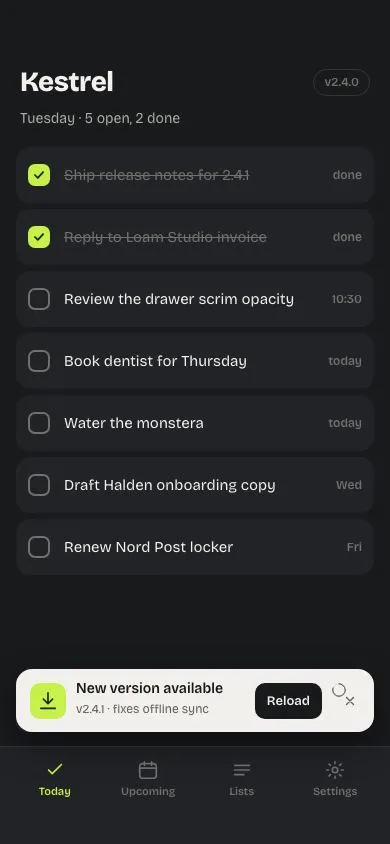
A 'New version available' toast rises above the bottom nav with a Reload action and a 10s countdown ring; Reload sweeps a lime panel over the screen showing v2.4.1, then reveals the updated app.
PWA offline library
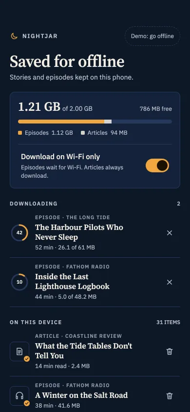
A saved-for-offline screen at night: storage meter, Wi-Fi-only switch, download rings, remove buttons, dimmed items with a reason, and an offline badge.
Phone launch splash lift
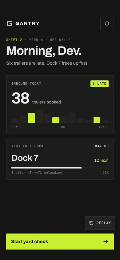
A 1.52s app launch: a G mark draws in three strokes, GANTRY rises letter by letter, then the splash lifts away to reveal the first home screen.
Weekly league with promotion climb
A 20-player weekly league on a phone: green promotion band, red demotion band, your dark row, and an end-of-week replay where you climb past rivals into Jade.
Grouped settings list
An iOS-style settings screen: inset grouped sections with 44px rows, coloured icon squares, 51×31 spring toggles with a stretching knob, chevron rows with values, footers and a profile row.
Phone profile header
A maker's profile: 92px initials avatar, tabular stats, a Follow button that morphs to Following, Posts/Saved/About tabs, and a glass top bar on scroll.