Nº 651 of 677
Feedback ladder on a send button
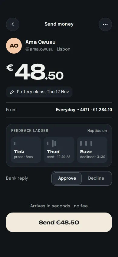
One Send payment button with three tiers of felt feedback made visible: a press tick, a success thud with a ring, an error buzz with a shake and red edge.
Preview
Use it
Free to use · credit appreciated1 Once, in your project · Node 22.20+
npx skills add SusanAcharya/Design-Lounge 2 Then ask
Using the Design Lounge skill, build "Feedback ladder on a send button" (piece motion-feedback-ladder) in my stack. Match its brief; restyle it onto my product's theme.
No skill? Paste the brief instead. It carries the numbers, tokens and behaviour.
<!-- Design Lounge Nº 651 · "Feedback ladder on a send button" · www.designlounge.live -->

# Feedback ladder on a send button

> **Build brief for a coding agent.** Rebuild this piece in the reader's stack. If they haven't said which stack, ask once, then default to semantic HTML + CSS + a little vanilla JS. Match the numbers below; don't "improve" them.

## What it is

The confirm screen of "Tallow", an invented peer-to-peer money app: you are sending €48.50 to Ama Owusu for a pottery class. One cream "Send €48.50" button carries three tiers of tactile feedback, each with its own weight: a **tick** the instant your finger lands (scale 0.97 in 80ms, an 8ms vibration), a **thud** when the money is sent (the button bulges and settles, a green ring rolls out from it, a 12-40-28 vibration), and a **buzz** when the bank declines (a decaying horizontal shake, a red edge, three 30ms pulses). A "Feedback ladder" card above the button makes the tiers visible: each rung lights in its colour and its waveform bars jump when that tier fires, so the haptics read even on a device that cannot vibrate. A "Bank reply" toggle forces Approve or Decline. Worth copying: three distinct intensities mapped to three meanings, and a reduced-motion version that swaps the shake for an icon.

## Reference behaviour

1. First frame, 390 × 844 dark iOS-style screen (the Lounge draws the status bar). 58px top padding. Nav row: 44px round back button, "Send money" (15/600), 44px round more button.
2. Recipient: 52px peach disc "AO" (Unbounded 16/700), "Ama Owusu" (17/600) and "@ama.owusu · Lisbon" (14, `#A3ACA8`).
3. Amount "€48.50" in Unbounded 68px/600, −0.04em; the "€" is 0.4em and raised, ".50" is 0.5em.
4. A note pill "Pottery class, Thu 12 Nov" with a pencil icon, then a hairline row "From  Everyday ·· 4471 · €1,284.10".
5. The ladder card (20px radius, `#1A2026`): header "FEEDBACK LADDER" (12/600, 0.08em tracking) and, at right, "Haptics on" when `navigator.vibrate` exists, otherwise "Haptics shown, not felt". Three rungs in a row: Tick "press · 8ms" (one short bar), Thud "sent · 12·40·28" (short bar, gap, two tall bars), Buzz "declined · 3×30" (three equal bars with gaps). Idle bars are `#5B6670`.
6. "Bank reply" with a two-option segmented control, "Approve" selected.
7. Bottom dock (thumb zone): hint "Arrives in seconds · no fee", the 64px cream button "Send €48.50" (Unbounded 17/600, radius 22).
8. **Press (tick):** on pointerdown or Enter/Space keydown the button scales to 0.97 over 80ms, `navigator.vibrate(8)` fires, and the Tick rung lights cream with its bar popping (scaleY 0.2 → 1.35 → 1, 340ms expo-out).
9. Release: the button returns to scale 1, turns `#D9D2C4`, shows a 20px spinner and "Sending"; the hint reads "Checking with your bank". After 900ms the bank replies.
10. **Approve (thud):** button fills `#46D39A`, label becomes a self-drawing check + "Sent to Ama", and the button does a bulge-and-settle (1 → 1.045 → 0.985 → 1.008 → 1 over 520ms). A 2px green ring centred on the button scales 0.6 → 5.6 and fades over 640ms. Vibrate `[12, 40, 28]`. The amount turns green. Hint: "€48.50 sent at 19:42 · ref TLW-8812". A "Send another" link appears.
11. **Decline (buzz):** the button shakes horizontally −10, 9, −7, 5, −3, 1, 0px over 420ms, gains a 2px `#FF6B5E` edge plus a 7px 18% red halo, and its label becomes "Try again". Vibrate `[30, 40, 30, 40, 30]`. The amount turns `#FFB3AB`. Hint, in red with an alert icon: "Declined by your bank. Nothing was sent." Link: "Use another card".
12. Pressing the button again from a finished state resets everything and starts at step 8. The link resets without sending.
13. Leaving the button with the pointer still down cancels the press without sending.
14. Reduced motion: no scale on press (the fill darkens to `#E4DCCD` instead), no bulge, no ring, no shake, no bar pop. Success is colour plus the check; decline is the red edge plus an alert icon inside the button. Vibration still fires.

## Structure

```
390 × 844
┌─────────────────────────────────────┐
│ 54 status (Lounge)                  │
│ (‹)        Send money          (…)  │ 58–102 nav
│ (AO) Ama Owusu                      │ +22
│      @ama.owusu · Lisbon            │
│ €48.50                              │ 68px display
│ [✎ Pottery class, Thu 12 Nov]       │
│ ─ From ─────── Everyday ·· 4471 ─── │
│ ┌ FEEDBACK LADDER ─── Haptics on ┐  │ ladder card

… 176 more lines. Copy or download for the full brief. Loading the source…Brief
216 linesBuild brief for a coding agent. Rebuild this piece in the reader’s stack. If they haven’t said which stack, ask once, then default to semantic HTML + CSS + a little vanilla JS. Match the numbers below; don’t “improve” them.
What it is
The confirm screen of “Tallow”, an invented peer-to-peer money app: you are sending €48.50 to Ama Owusu for a pottery class. One cream “Send €48.50” button carries three tiers of tactile feedback, each with its own weight: a tick the instant your finger lands (scale 0.97 in 80ms, an 8ms vibration), a thud when the money is sent (the button bulges and settles, a green ring rolls out from it, a 12-40-28 vibration), and a buzz when the bank declines (a decaying horizontal shake, a red edge, three 30ms pulses). A “Feedback ladder” card above the button makes the tiers visible: each rung lights in its colour and its waveform bars jump when that tier fires, so the haptics read even on a device that cannot vibrate. A “Bank reply” toggle forces Approve or Decline. Worth copying: three distinct intensities mapped to three meanings, and a reduced-motion version that swaps the shake for an icon.
Reference behaviour
- First frame, 390 × 844 dark iOS-style screen (the Lounge draws the status bar). 58px top padding. Nav row: 44px round back button, “Send money” (15/600), 44px round more button.
- Recipient: 52px peach disc “AO” (Unbounded 16/700), “Ama Owusu” (17/600) and “@ama.owusu · Lisbon” (14,
#A3ACA8). - Amount “€48.50” in Unbounded 68px/600, −0.04em; the ”€” is 0.4em and raised, “.50” is 0.5em.
- A note pill “Pottery class, Thu 12 Nov” with a pencil icon, then a hairline row “From Everyday ·· 4471 · €1,284.10”.
- The ladder card (20px radius,
#1A2026): header “FEEDBACK LADDER” (12/600, 0.08em tracking) and, at right, “Haptics on” whennavigator.vibrateexists, otherwise “Haptics shown, not felt”. Three rungs in a row: Tick “press · 8ms” (one short bar), Thud “sent · 12·40·28” (short bar, gap, two tall bars), Buzz “declined · 3×30” (three equal bars with gaps). Idle bars are#5B6670. - “Bank reply” with a two-option segmented control, “Approve” selected.
- Bottom dock (thumb zone): hint “Arrives in seconds · no fee”, the 64px cream button “Send €48.50” (Unbounded 17/600, radius 22).
- Press (tick): on pointerdown or Enter/Space keydown the button scales to 0.97 over 80ms,
navigator.vibrate(8)fires, and the Tick rung lights cream with its bar popping (scaleY 0.2 → 1.35 → 1, 340ms expo-out). - Release: the button returns to scale 1, turns
#D9D2C4, shows a 20px spinner and “Sending”; the hint reads “Checking with your bank”. After 900ms the bank replies. - Approve (thud): button fills
#46D39A, label becomes a self-drawing check + “Sent to Ama”, and the button does a bulge-and-settle (1 → 1.045 → 0.985 → 1.008 → 1 over 520ms). A 2px green ring centred on the button scales 0.6 → 5.6 and fades over 640ms. Vibrate[12, 40, 28]. The amount turns green. Hint: “€48.50 sent at 19:42 · ref TLW-8812”. A “Send another” link appears. - Decline (buzz): the button shakes horizontally −10, 9, −7, 5, −3, 1, 0px over 420ms, gains a 2px
#FF6B5Eedge plus a 7px 18% red halo, and its label becomes “Try again”. Vibrate[30, 40, 30, 40, 30]. The amount turns#FFB3AB. Hint, in red with an alert icon: “Declined by your bank. Nothing was sent.” Link: “Use another card”. - Pressing the button again from a finished state resets everything and starts at step 8. The link resets without sending.
- Leaving the button with the pointer still down cancels the press without sending.
- Reduced motion: no scale on press (the fill darkens to
#E4DCCDinstead), no bulge, no ring, no shake, no bar pop. Success is colour plus the check; decline is the red edge plus an alert icon inside the button. Vibration still fires.
Structure
390 × 844
┌─────────────────────────────────────┐
│ 54 status (Lounge)                  │
│ (‹)        Send money          (…)  │ 58–102 nav
│ (AO) Ama Owusu                      │ +22
│      @ama.owusu · Lisbon            │
│ €48.50                              │ 68px display
│ [✎ Pottery class, Thu 12 Nov]       │
│ ─ From ─────── Everyday ·· 4471 ─── │
│ ┌ FEEDBACK LADDER ─── Haptics on ┐  │ ladder card
│ │ [▮ Tick ] [▮ ▮▮ Thud] [▮ ▮ ▮ Buzz]│ 3 × minmax(0,1fr), gap 8
│ └────────────────────────────────┘  │
│ Bank reply        [Approve|Decline] │ seg 200 × 46
│                                     │ flexible space
│     Arrives in seconds · no fee     │ msg 22, aria-live
│ ┌─────────────────────────────────┐ │
│ │          Send €48.50            │ │ 64 tall, r 22
│ └─────────────────────────────────┘ │
│            Send another             │ 40, hidden until done
└─────────────────────────────────────┘ 34 bottom pad
<main class="app">: flex column, max-width 430, padding58px 20px 34px; the dock usesmargin-top: auto..nav: two<button>s witharia-labeland a<b>title..who,.amt(<p>witharia-label="48 euros 50"),.note,.from.<section class="ladder" aria-label="Feedback tiers">with three.rungdivs; waveforms arearia-hiddenspans..seg role="group"labelled by “Bank reply”, twoaria-pressedbuttons..dock:<p class="msg" aria-live="polite">,.bwwrapper holding the.ringand<button class="go">, then<button class="again">.
Tokens
:root {
  /* surfaces */
  --bg: #101418;
  --surface: #1a2026;
  --surface-2: #232b33;
  --line: #2e3740;
  --idle-bar: #5b6670;      /* also the segmented control's 1px border */
  /* ink */
  --ink: #eef1ec;
  --ink-2: #a3aca8;         /* 7.6:1 on bg */
  /* action and outcomes */
  --cream: #f2ebdd;         /* primary button */
  --cream-ink: #14181c;
  --cream-busy: #d9d2c4;
  --cream-press-rm: #e4dccd;
  --ok: #46d39a;            /* thud */
  --ok-ink: #06261a;
  --ok-rung: #14291f;
  --err: #ff6b5e;           /* buzz */
  --err-rung: #3a1716;
  --err-amount: #ffb3ab;
  --tick-rung: #2b2a26;
  --tint: #f6c9a8;          /* avatar */
  /* type */
  --display: "Unbounded", system-ui, sans-serif;
  --sans: "Epilogue", system-ui, sans-serif;
  --fs-amount: 68px; --fs-button: 17px; --fs-name: 17px; --fs-body: 15px; --fs-meta: 14px; --fs-rung: 13px; --fs-label: 12px; --fs-rung-meta: 11.5px;
  /* space and shape */
  --pad: 20px; --gap-rungs: 8px;
  --r-button: 22px; --r-card: 20px; --r-rung: 14px; --r-seg: 14px; --r-seg-item: 11px; --r-note: 12px;
  --button-h: 64px; --control: 44px;
  /* haptics (navigator.vibrate patterns, ms) */
  --hap-tick: 8;
  --hap-thud: 12 40 28;
  --hap-buzz: 30 40 30 40 30;
  /* motion */
  --ease: cubic-bezier(.2,.7,.2,1);
  --out: cubic-bezier(.16,1,.3,1);
  --shake: cubic-bezier(.36,.07,.19,.97);
  --d-press: 80ms; --press-scale: .97;
  --d-reply: 900ms;          /* simulated bank round trip */
  --d-thud: 520ms; --d-ring: 640ms; --ring-scale: 5.6;
  --d-buzz: 420ms; --buzz-amp: 10px;
  --d-check: 360ms; --check-delay: 120ms;
  --d-bar: 340ms; --bar-stagger: 40ms;
  --d-colour: 260ms;
}
Typography
| Role | Family | Size | Weight | Line-height | Tracking | Case |
|---|---|---|---|---|---|---|
| Amount | Unbounded | 68px (€ 0.4em, cents 0.5em) | 600 | 1 | −0.04em | — |
| Button | Unbounded | 17px | 600 | 1 | −0.01em | Sentence |
| Avatar, rung name | Unbounded | 16px / 13px | 700 / 600 | 1 | −0.01em | — |
| Recipient name | Epilogue | 17px | 600 | 1.45 | 0 | Title |
| Body, seg, hint | Epilogue | 14–15px | 400–600 | 1.45 | 0 | Sentence |
| Ladder header | Epilogue | 12px | 600 | 1.45 | 0.08em | Upper |
| Rung meta | Epilogue | 11.5px | 400 | 1.45 | −0.01em | Lower, nowrap |
Motion
| Tier / thing | Trigger | Property | From → to | Duration, easing | Haptic | Reduced motion |
|---|---|---|---|---|---|---|
| Tick | pointerdown, key down | transform | scale 1 → 0.97 | 80ms --ease | vibrate(8) | fill → #E4DCCD, no scale |
| Sending | release | background, label | cream → #D9D2C4, spinner | 260ms; spinner 700ms/turn linear | — | spinner 1400ms/turn |
| Thud | approve | transform | 1 → 1.045 → 0.985 → 1.008 → 1 (22/48/72%) | 520ms --out | [12,40,28] | none |
| Thud ring | approve | transform, opacity | scale 0.6, 0.9 → 5.6, 0 | 640ms --out | — | none |
| Check | approve | stroke-dashoffset | 24 → 0 | 360ms --out, 120ms delay | — | drawn at once |
| Buzz | decline | translateX | 0, −10, 9, −7, 5, −3, 1, 0px | 420ms --shake | [30,40,30,40,30] | none; alert icon in the label |
| Red edge | decline | box-shadow | none → 0 0 0 2px #FF6B5E, 0 0 0 7px rgba(255,107,94,.18) | 200ms --ease | — | same |
| Amount colour | outcome | color | ink → #46D39A / #FFB3AB | 300ms --ease | — | same |
| Rung light | any tier | background, border | idle → tier colour | 240ms --ease | — | same |
| Rung bars | any tier | scaleY | 0.2 → 1.35 → 1 | 340ms --out, 40ms stagger | — | none |
States
- Idle: cream button, hint “Arrives in seconds · no fee”, rungs dark.
- Pressed: scale 0.97 (or darker fill under reduced motion); Tick rung lit.
- Busy:
aria-busy="true",#D9D2C4, spinner + “Sending”; further presses are ignored. - Sent: green button, check + “Sent to Ama”, amount green, Thud rung lit, “Send another” visible.
- Declined: cream button with red edge, “Try again”, amount
#FFB3AB, red hint with alert icon, Buzz rung lit, “Use another card” visible. - Bank reply toggle: selected option
#232B33fill with a 1px#4A545Einner line, ink text; the other#A3ACA8. - Focus-visible: 3px cream outline, 3px offset, 14px radius on every control.
- No vibration support: ladder header says “Haptics shown, not felt”; everything else is identical.
Accessibility
- The send control is a real
<button>; Enter and Space give the same press-and-release as touch (keydown presses, keyup releases; key repeat ignored). - The hint line is
aria-live="polite", so “Checking with your bank”, the sent receipt and the decline reason are announced. The busy state usesaria-busy. - The decline is never colour alone: the copy changes (“Try again”, “Nothing was sent.”) and an alert icon appears.
- Segmented control:
role="group"labelled by “Bank reply”, options witharia-pressed. - Wrap
navigator.vibrateintry/catch; sandboxed frames and some browsers throw or ignore it. - Contrast:
#A3ACA8on#1014187.6:1;#FF6B5Ehint on#1014186.6:1;#06261Aon#46D39A8.5:1; the segmented border#5B6670is 3.1:1 on#1A2026. - Hit targets: button 64px, nav 44px, segments 40px, links 40px.
Responsive rules
- At 360 wide the amount stays 68px (it is four characters); the rungs keep three columns because they use
minmax(0, 1fr); the rung meta is nowrap at 11.5px and fits 98px. - On short screens (under 740px tall) the flexible gap above the dock collapses first; the dock never leaves the bottom.
- Above 430px wide the column centres at 430px.
- Keep the 58px top padding and 34px bottom padding clear of fixed controls.
Acceptance checklist
Always
- Three feedback tiers with distinct weight: press tick (scale 0.97, 80ms), success thud (bulge-and-settle 520ms + ring 640ms), error buzz (decaying 420ms shake + red edge).
- Each tier calls
navigator.vibratewith its own pattern (8; 12,40,28; 30,40,30,40,30), guarded bytry/catch. - Each tier lights its rung in the ladder card, so feedback is visible without a motor.
- The toggle forces the next outcome; the reply arrives 900ms after release.
- Keyboard press and release behave like touch; key repeat does not resend.
- Busy state ignores repeat presses and sets
aria-busy. - Outcome text lands in a polite live region; decline is not colour-only.
- Reduced motion: no scale, bulge, ring, shake or bar pop; colour plus icon instead.
- Hit targets ≥ 40px;
scrollWidthstays 390.
This demo
- Amount “€48.50” to “Ama Owusu”, note “Pottery class, Thu 12 Nov”, account “Everyday ·· 4471 · €1,284.10”.
- Success copy “Sent to Ama” and “€48.50 sent at 19:42 · ref TLW-8812”.
- Decline copy “Try again” and “Declined by your bank. Nothing was sent.”
Implementation notes
1. One function per tier, haptic and visual together. Restart the rung animation by removing the class and forcing a reflow, or a second tick in a row will not replay.
const PAT = { tick: 8, thud: [12, 40, 28], buzz: [30, 40, 30, 40, 30] };
const feel = (tier) => {
  try { if (typeof navigator.vibrate === 'function') navigator.vibrate(PAT[tier]); } catch (e) {}
  const rung = document.getElementById(tier);
  rung.classList.remove('on'); rung.offsetWidth; rung.classList.add('on');
};
2. The thud and the buzz are keyframes, not transitions. The press uses a transition (it must follow the finger up and down), but the outcomes are fixed shapes. The shake decays so it reads as “no”, not as a glitch.
.go.ok  { animation: thud 520ms cubic-bezier(.16,1,.3,1); }
@keyframes thud { 22% { transform: scale(1.045) } 48% { transform: scale(.985) } 72% { transform: scale(1.008) } }
.go.err { box-shadow: 0 0 0 2px #ff6b5e, 0 0 0 7px rgba(255,107,94,.18);
          animation: buzz 420ms cubic-bezier(.36,.07,.19,.97); }
@keyframes buzz { 14% { transform: translateX(-10px) } 28% { transform: translateX(9px) }
  42% { transform: translateX(-7px) } 57% { transform: translateX(5px) } 71% { transform: translateX(-3px) } 85% { transform: translateX(1px) } }
3. Press on down, commit on up. Fire the tick on pointerdown (latency is the whole point of a tick), but only send on pointerup while still pressed; pointerleave cancels. Mirror it with keydown/keyup and ignore e.repeat. Centre the ring on the button by wrapping both in a position: relative box; anchoring it to the dock puts it off-centre once the link below appears.
Common mistakes: firing the tick on click (it lands after release, 100ms+ late), reusing the same vibration for success and failure, and dropping the error cue entirely under reduced motion instead of swapping it for an icon.
Details
- Palette
- Type
- Unbounded · Epilogue
- Motion
- Rich motion
- Build
- One session
- Tags
Similar
Slide to pay back a friend
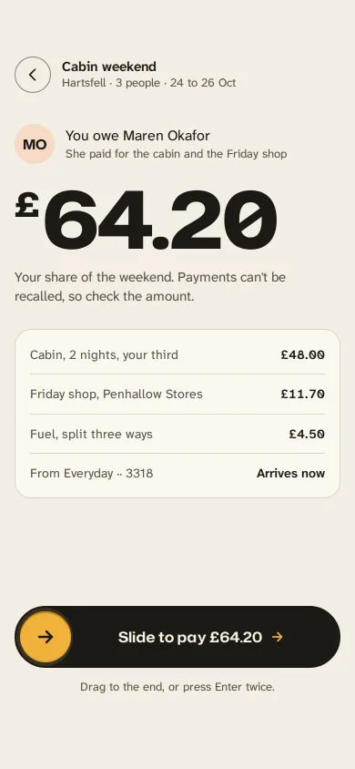
A gold handle you drag along an ink track to repay a friend: letters dim as it passes, it resists near the end, snaps through at 90% and becomes a receipt.
Hold and slide to confirm
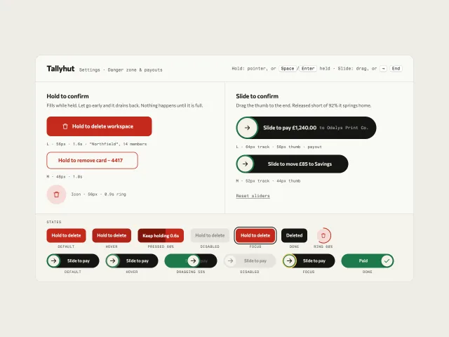
Hold-to-delete buttons that fill while held and drain on release, plus slide-to-pay tracks that spring home short of 92%, all with keyboard paths.
Island live activities
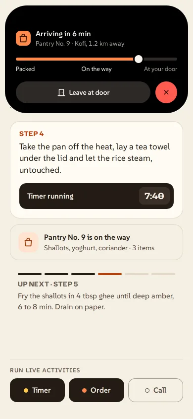
A black pill at the top of the screen that springs between a timer, a food order and a call, splits in two, and grows into a card with controls.
Control centre toggles
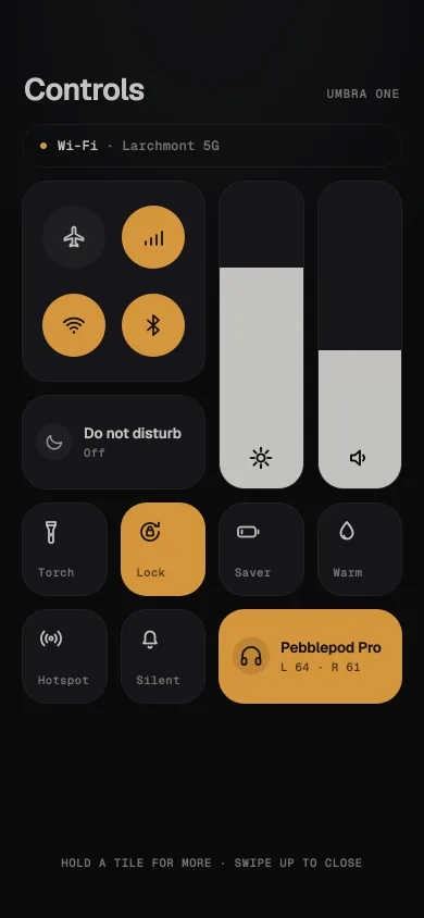
A near-black control centre: radio cluster, tall brightness and volume sliders with rubber-band overdrag, and springy amber toggles that change the screen.
Edge light button
A gold edge travels around Open the gate. Click says the gate opened on this page.
Phone comments sheet
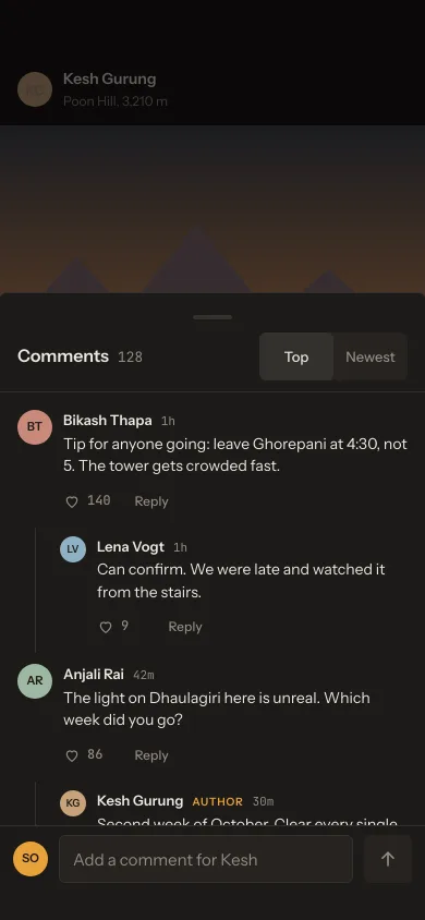
A dark comments sheet over a dimmed post: Top/Newest sort, one level of threaded replies, like toggles, a reply chip, and a composer that stays off until you type.