Nº 663 of 677
Werk Bauhaus habit grid
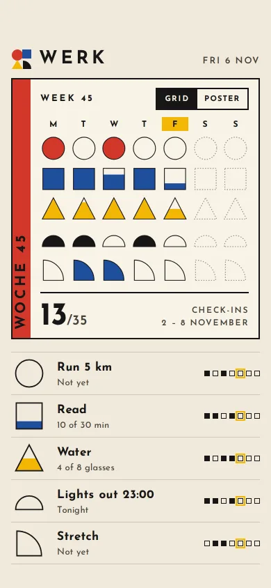
A habit tracker built from circles, squares and triangles: each habit is a shape that fills as you check in, and the week becomes a small Bauhaus poster.
Preview
Use it
Free to use · credit appreciated1 Once, in your project · Node 22.20+
npx skills add SusanAcharya/Design-Lounge 2 Then ask
Using the Design Lounge skill, build "Werk Bauhaus habit grid" (piece style-bauhaus-habit-grid) in my stack. Match its brief; restyle it onto my product's theme.
No skill? Paste the brief instead. It carries the numbers, tokens and behaviour.
<!-- Design Lounge Nº 663 · "Werk Bauhaus habit grid" · www.designlounge.live -->

# Werk Bauhaus habit grid

> **Build brief for a coding agent.** Rebuild this piece in the reader's stack. If they haven't said which stack, ask once, then default to semantic HTML + CSS + a little vanilla JS. Match the numbers below; don't "improve" them.

## What it is

The today screen of Werk, a habit tracker whose whole language is Bauhaus primitives: a circle, a square, a triangle, a half disc and a quarter disc, in primary red, yellow, blue and black on warm off-white. Every habit owns one shape. Checking in fills the shape from the bottom like a glass, so "4 of 8 glasses" is a half-filled yellow triangle, not a progress bar. Above the list, the week is a 7 × 5 poster of the same shapes; switch it to Poster view and the outlines, day letters and gaps disappear, a yellow sun and a black bar slide in, and the week's check-ins are left as a composition you would pin up. The detail worth copying: one fill component drives both the button and the poster cell, so the poster is literally made of your week.

## Reference behaviour

1. First frame: Friday 6 November, week 45 (2 to 8 November). The poster shows Monday to Thursday filled from history, Friday partly filled, Saturday and Sunday as dotted outlines. The count reads "13/35". Grid view is selected.
2. Habits, top to bottom: Run 5 km (red circle, 1 step), Read (blue square, 3 steps of 10 minutes), Water (yellow triangle, 8 glasses), Lights out 23:00 (black half disc, 1 step), Stretch (blue quarter disc, 1 step).
3. Today's starting fills: Run 0, Read 1/3 ("10 of 30 min"), Water 4/8 ("4 of 8 glasses"), Lights out 0 ("Tonight"), Stretch 0 ("Not yet").
4. Tapping a shape adds one step: the coloured fill rises (translateY, 420ms expo out) inside the shape's clip, and the same habit's Friday cell in the poster rises with it (520ms).
5. When a habit reaches its target, the button shape and the poster cell pop (scale .4, rotate −30° → 1.12 → 1, 460ms), the Friday square in that row's week strip turns solid, and the count goes up by one.
6. Tapping a full shape empties it (back to 0) and the count goes down; this is the undo.
7. A polite live region says "Water, 5 of 8 glasses. 13 of 35 this week."
8. The Grid / Poster segmented control (top right of the poster) toggles views. Poster: grid gap 6px → 0 (420ms expo), day letters and outlines fade out (240–300ms), the count grows 46px → 60px, and a yellow circle (r 84) with a black 14px bar rotated −24° slides in from the right (translateX 40px, rotate 20° → 0, 620ms expo). Grid reverses it.
9. Each row's week strip is seven 8px squares: solid for done days, outline otherwise, Friday ringed in yellow.

## Structure

```
390 × 844, off-white ground
┌──────────────────────────────────────┐
│ 54px clear                           │
│ [●■▲◗] WERK               FRI 6 NOV  │ header 44h; logo 30px, 26px/700 .18em
│ ┌──┬────────────────────────────────┐│ poster: 2px ink border, pad 12 14 12 40
│ │W │ WEEK 45          [GRID|POSTER] ││ band 26w red, vertical "WOCHE 45"
│ │O │  M  T  W  T [F] S  S           ││ day letters 12px, today on yellow
│ │C │  ●  ○  ●  ○  ●  ◌  ◌           ││ 7 × 5 cells, square, gap 6
│ │H │  ■  ■  ▄  ■  ▁  ◌  ◌           ││ dotted outlines for the future
│ │E │  ▲  ▲  ▲  ▲  ▴  ◌  ◌           ││
│ │  │  ◗  ◗  ◠  ◗  ◠  ◌  ◌           ││
│ │4 │  ◜  ◣  ◣  ◜  ◜  ◌  ◌           ││
│ │5 │ ───────────────────────────────││ 2px rule
│ │  │ 13/35          CHECK-INS       ││ 46px count; 12px caps right
│ └──┴────────────────────────────────┘│

… 162 more lines. Copy or download for the full brief. Loading the source…Brief
202 linesBuild brief for a coding agent. Rebuild this piece in the reader’s stack. If they haven’t said which stack, ask once, then default to semantic HTML + CSS + a little vanilla JS. Match the numbers below; don’t “improve” them.
What it is
The today screen of Werk, a habit tracker whose whole language is Bauhaus primitives: a circle, a square, a triangle, a half disc and a quarter disc, in primary red, yellow, blue and black on warm off-white. Every habit owns one shape. Checking in fills the shape from the bottom like a glass, so “4 of 8 glasses” is a half-filled yellow triangle, not a progress bar. Above the list, the week is a 7 × 5 poster of the same shapes; switch it to Poster view and the outlines, day letters and gaps disappear, a yellow sun and a black bar slide in, and the week’s check-ins are left as a composition you would pin up. The detail worth copying: one fill component drives both the button and the poster cell, so the poster is literally made of your week.
Reference behaviour
- First frame: Friday 6 November, week 45 (2 to 8 November). The poster shows Monday to Thursday filled from history, Friday partly filled, Saturday and Sunday as dotted outlines. The count reads “13/35”. Grid view is selected.
- Habits, top to bottom: Run 5 km (red circle, 1 step), Read (blue square, 3 steps of 10 minutes), Water (yellow triangle, 8 glasses), Lights out 23:00 (black half disc, 1 step), Stretch (blue quarter disc, 1 step).
- Today’s starting fills: Run 0, Read 1/3 (“10 of 30 min”), Water 4/8 (“4 of 8 glasses”), Lights out 0 (“Tonight”), Stretch 0 (“Not yet”).
- Tapping a shape adds one step: the coloured fill rises (translateY, 420ms expo out) inside the shape’s clip, and the same habit’s Friday cell in the poster rises with it (520ms).
- When a habit reaches its target, the button shape and the poster cell pop (scale .4, rotate −30° → 1.12 → 1, 460ms), the Friday square in that row’s week strip turns solid, and the count goes up by one.
- Tapping a full shape empties it (back to 0) and the count goes down; this is the undo.
- A polite live region says “Water, 5 of 8 glasses. 13 of 35 this week.”
- The Grid / Poster segmented control (top right of the poster) toggles views. Poster: grid gap 6px → 0 (420ms expo), day letters and outlines fade out (240–300ms), the count grows 46px → 60px, and a yellow circle (r 84) with a black 14px bar rotated −24° slides in from the right (translateX 40px, rotate 20° → 0, 620ms expo). Grid reverses it.
- Each row’s week strip is seven 8px squares: solid for done days, outline otherwise, Friday ringed in yellow.
Structure
390 × 844, off-white ground
┌──────────────────────────────────────┐
│ 54px clear                           │
│ [●■▲◗] WERK               FRI 6 NOV  │ header 44h; logo 30px, 26px/700 .18em
│ ┌──┬────────────────────────────────┐│ poster: 2px ink border, pad 12 14 12 40
│ │W │ WEEK 45          [GRID|POSTER] ││ band 26w red, vertical "WOCHE 45"
│ │O │  M  T  W  T [F] S  S           ││ day letters 12px, today on yellow
│ │C │  ●  ○  ●  ○  ●  ◌  ◌           ││ 7 × 5 cells, square, gap 6
│ │H │  ■  ■  ▄  ■  ▁  ◌  ◌           ││ dotted outlines for the future
│ │E │  ▲  ▲  ▲  ▲  ▴  ◌  ◌           ││
│ │  │  ◗  ◗  ◠  ◗  ◠  ◌  ◌           ││
│ │4 │  ◜  ◣  ◣  ◜  ◜  ◌  ◌           ││
│ │5 │ ───────────────────────────────││ 2px rule
│ │  │ 13/35          CHECK-INS       ││ 46px count; 12px caps right
│ └──┴────────────────────────────────┘│
│ ──────────────────────────────────── │ list rows 61h, 1.5px rules
│ (●)  Run 5 km              ■□■□[□]□□ │ shape button 52 × 52
│ (■)  Read  10 of 30 min    ■■□■[□]□□ │
│ (▲)  Water 4 of 8 glasses  ■□■■[□]□□ │
│ (◗)  Lights out 23:00      ■■□■[□]□□ │
│ (◜)  Stretch               □■■□[□]□□ │
│ 34px clear                           │
└──────────────────────────────────────┘headerwith the logo (four primitives in a 30px SVG) and the date.section.poster[aria-label]: decorative reddiv.band,.ptopwith arole=groupsegmented control of twobutton[aria-pressed],aria-hiddenday letters anddiv.gridof 35div.celleach holding one shape SVG, a decorativesvg.deco, and the count.ul.list[aria-label="Today's habits"]: eachliis a grid52px 1fr auto:button.shapewith anaria-labelthat includes the current value, the name and detail, and a week strip with anaria-label(“3 of 5 days so far”).
Tokens
:root {
  /* ground */
  --paper: #F1EADB;    /* screen */
  --card: #F8F3E8;     /* poster stock */
  --rule: #CFC6B4;     /* list rules */
  /* ink */
  --ink: #161616;      /* text, outlines, the black primitive */
  --ink-2: #45413A;    /* secondary text */
  --future: #8A8476;   /* dotted outlines for days to come */
  /* primaries: shapes only, never small text */
  --red: #D2382B;
  --yellow: #F2B705;
  --blue: #1F4E9C;
  /* type */
  --font: "Josefin Sans", system-ui, sans-serif;
  --fs-count: 46px;  --fs-count-poster: 60px;  --fs-logo: 26px;  --fs-band: 20px;
  --fs-name: 17px;   --fs-detail: 13px;        --fs-label: 12–13px; --fs-seg: 11px;
  /* layout */
  --pad-x: 16px;  --row: 61px;  --shape: 52px;  --gap: 6px;  --band: 26px;
  --border: 2px;  --outline: 1.5px;  --radius: 0;
  /* motion */
  --ease: cubic-bezier(.2,.7,.2,1);
  --expo: cubic-bezier(.16,1,.3,1);
  --t-fill: 420ms; --t-cell: 520ms; --t-pop: 460ms; --t-view: 420ms; --t-deco: 620ms; --t-press: 160ms;
}
Shapes on a 52 × 52 viewBox: circle cx 26 cy 26 r 22; square x 5 y 5 w 42 h 42; triangle M26 4L48 46H4z; half disc M4 40A22 22 0 0 1 48 40z; quarter disc M6 46V6a40 40 0 0 1 40 40z.
Typography
One geometric family, Josefin Sans, set wide and in caps for labels.
| Role | Size | Weight | Line-height | Tracking | Case |
|---|---|---|---|---|---|
| Poster count | 46px (60px in Poster), “/35” 20px 600 | 700 | .8 | −0.02em | — |
| Logo | 26px | 700 | 1 | 0.18em | upper |
| Band “WOCHE 45” | 20px, vertical | 700 | 26px | 0.2em | upper |
| Habit name | 17px | 700 | 1.3 | 0.02em | sentence |
| Week label | 13px | 700 | 1 | 0.22em | upper |
| Date, detail | 13px | 600 / 400 | 1.3 | 0.14em / 0.02em | upper / sentence |
| Day letters, footer label | 12px | 700 / 600 | 1.5 | 0.06–0.14em | upper |
| Segmented control | 11px | 700 | 1 | 0.14em | upper |
Motion
| What | Trigger | From → to | Duration / easing | Reduced motion |
|---|---|---|---|---|
| Button fill | tap | translateY (1 − f) × 52px | 420ms expo | instant |
| Poster cell fill | tap | same | 520ms expo | instant |
| Pop | habit completes | scale .4 / −30° → 1.12 → 1 | 460ms expo | none |
| Press | pointer down | scale 1 → .92 | 160ms ease | none |
| Grid gap | view switch | 6px ↔ 0 | 420ms expo | instant |
| Outlines, day letters | view switch | opacity 1 ↔ 0 | 240–300ms ease | instant |
| Count size | view switch | 46px ↔ 60px | 420ms expo | instant |
| Sun and bar | to Poster | opacity 0, x 40px, 20° → rest | 420ms / 620ms expo | fades only |
States
- Empty: shape outline only (2px ink on the button, 1.5px in the poster).
- Partial: colour fills the lower part of the shape in exact proportion (1/3, 4/8).
- Done: fully filled; the week-strip square for today turns solid.
- Future days: dotted outline,
--future, never filled. - Today: the F column letter on a yellow plate; the Friday square in each strip ringed 2px yellow.
- Poster view: no outlines, no letters, no gaps, sun and bar shown; the list stays interactive and still updates the poster.
- Pressed: shape button scales to .92.
- Focus-visible: 3px blue outline, 3px offset.
Accessibility
- Each shape is a real
buttonwhose label includes the value: “Water: 4 of 8 glasses. Tap to check in”; it is rewritten after every tap. - A polite live region reports the new value and the weekly total.
- The poster grid is
aria-hidden; the same information is in the buttons and the week-strip labels. - The view control is a
role=groupof twoaria-pressedbuttons. - Contrast: all text is ink or
--ink-2on off-white. The band text is 20px bold black on red (3.7:1, large text). Red, yellow and blue never carry small text. - Hit targets: shape buttons 52 × 52 in 61px rows; segmented buttons 58 × 32 inside a 2px frame (the full row height is 61px for the habits).
Responsive rules
- The column is max 430px wide and centred. The poster grid cells are
1frsquares, so at 360 wide they shrink to about 30px and stay square. - If the viewport is shorter than 760px, let the list scroll and keep the poster at its natural height.
- At tablet width, place the poster and the list side by side (poster 420px, list 360px).
Acceptance checklist
Always
- Five habits, five distinct primitives; each habit’s colour is used for nothing else in that row.
- Checking in raises a clipped fill inside the shape, in exact proportion to the target.
- The button and the poster cell for today update together from one function.
- Completing a habit pops both shapes and adds one to the weekly count; tapping a full shape empties it.
- Future days are dotted outlines and cannot be filled.
- Poster view removes outlines, letters and gaps and adds the sun and bar without moving the list.
- Buttons announce their value; a live region reports each change.
- No small text on red, yellow or blue; scroll width stays 390.
- Reduced motion keeps the fills and the view switch, without pops or slides.
This demo
- Werk, Fri 6 Nov, week 45, 2 to 8 November.
- Count starts at 13/35.
- Run 5 km, Read (10 of 30 min), Water (4 of 8 glasses), Lights out 23:00 (Tonight), Stretch (Not yet).
Implementation notes
One shape, clipped fill. Clip a full-size rect to the shape and move the rect down; the outline is drawn on top in a separate group:
const S = { tri: '<path d="M26 4L48 46H4z"/>' /* ... */ };
let uid = 0;
const shape = (h, frac) => { const id = 'c' + uid++;
  return `<svg viewBox="0 0 52 52"><defs><clipPath id="${id}">${S[h.s]}</clipPath></defs>
    <g clip-path="url(#${id})"><rect class="f" width="52" height="52" fill="${h.c}"
      style="transform:translateY(${(1 - frac) * 52}px)"/></g>
    <g class="o">${S[h.s]}</g></svg>`; };
const setFill = (svg, f) => svg.querySelector('.f').style.transform = `translateY(${(1 - f) * 52}px)`;
Every clip-path id must be unique: 35 poster cells plus 5 buttons share the same shapes.
Poster view is CSS only. A single class on the poster removes the grid scaffolding:
.grid { display: grid; grid-template-columns: repeat(7, 1fr); gap: var(--gap, 6px);
  transition: gap 420ms cubic-bezier(.16,1,.3,1); }
.poster.art { --gap: 0px; }
.poster.art .cols, .poster.art .o { opacity: 0; }
.poster.art .big { font-size: 60px; }
.poster.art .deco { opacity: 1; transform: none; }
Step logic with a built-in undo. Steps wrap from full back to zero, so the same tap target both checks in and undoes:
let n = Math.round(h.d[TODAY] * h.of);
n = n >= h.of ? 0 : n + 1;
h.d[TODAY] = n / h.of;
Common mistakes: using rounded corners (Bauhaus primitives are hard-edged), putting labels on red or yellow at small sizes, drawing progress as a separate bar instead of filling the shape, and letting the sun overlap the count or footer labels.
Details
- Palette
- Type
- Josefin Sans
- Motion
- Subtle motion
- Build
- One session
- Tags
Studied
Tailwind CSS docsPut each instruction next to its code. Draw the grid with thin lines and let the empty sides carry a faint hatch.
All sourcesSimilar
Bauhaus design language kit
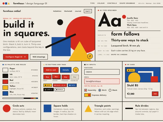
A full Bauhaus UI dialect on one sheet: red, yellow, blue and ink on paper, circle/square/triangle grammar, Josefin Sans lowercase headlines, hard-shadow controls.
Bauhaus composition hero
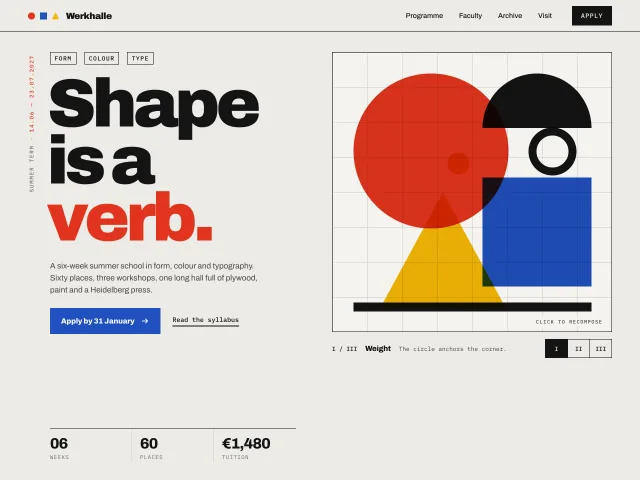
A summer-school hero whose primary-colour circle, square, triangle and half-disc rearrange into three compositions on click, beside a 136px grotesk headline.
Handbill riso gig guide
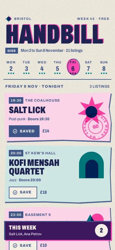
A city gig guide printed in fluoro pink, teal and federal blue: overprinted shapes, misregistration, grain, a week strip and a stamp that saves a gig.
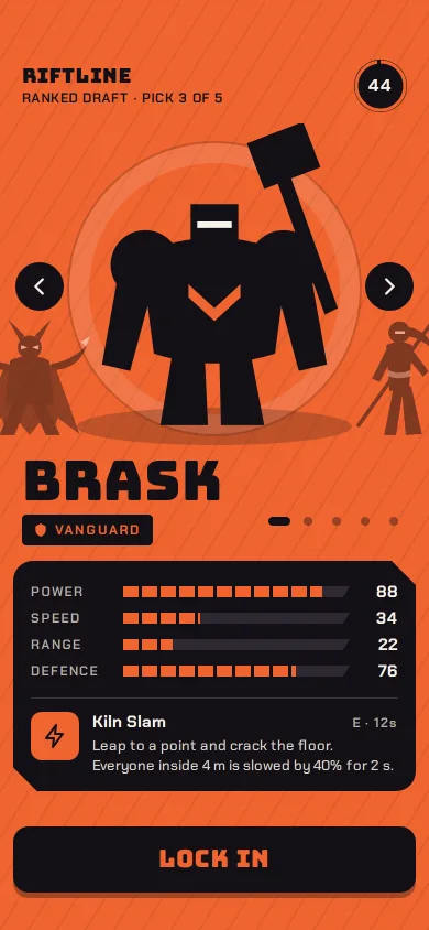
Riftline hero select
A phone character select: five SVG silhouettes on a swipe carousel, the screen floods to each hero's colour, stat bars morph, and Lock in stamps READY.
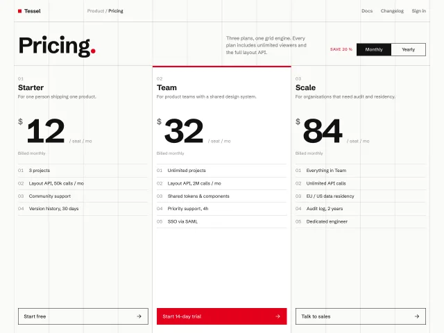
Swiss grid pricing
Pricing page on a visible 12-column hairline grid: three tiers in strict 4-column blocks, numbered features, red accent, and a monthly/yearly switch that tweens the prices.
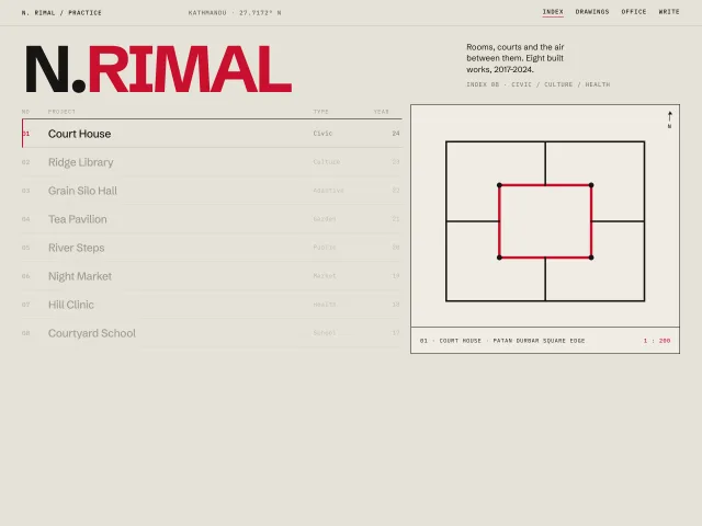
Architect index with plan drawings
A Swiss architect index: 120px wordmark, an 8-row 12-column project list, and a sticky right panel that crossfades a geometric plan on hover.